
Visa Indonesia: Redesigning a visa services platform end to end.
Visa Indonesia is a Bali-based agency that helps travelers, expats, and businesses apply for and extend Indonesian visas online. The product was working, customers were coming in, but the digital experience didn’t match the level of trust the service required.
I came in for what looked like a homepage test. Modernize the home page, the existing designs were old, here are some references we like, take it from there. I delivered the homepage. They liked it. From there, the project quietly grew into the entire system: the website, the customer portal, the affiliate program, a design system from scratch, transactional emails, PDFs, social media, and a custom mascot system that ended up running through the brand. I came in as sole designer and stayed sole designer through every surface.
Visa platforms deal with high-stakes user decisions.
People aren’t browsing – they’re trying to answer urgent questions about whether they can legally enter a country, work in it, retire in it, raise a family in it. If the interface doesn’t feel official and trustworthy, they leave. The old site didn’t carry that weight. Beyond trust, the product was structurally fragmented – inconsistent layouts, no design system, buried information, dropdowns that overwhelmed instead of helped, application forms that felt long and manual.
Learning the visa product before designing for it.
The first weeks were research, not design. I went deep into Indonesian visas: every type, who it’s for, how long it lasts, what documents are required, what the user receives at the end. KITAS and KITAP especially needed time. These aren’t tourist documents – they’re long-stay and permanent-stay permits used by expats, foreign workers, retirees, and spouses of Indonesian citizens. The product page for a KITAS isn’t selling a vacation, it’s selling a life decision. That changes how it has to be designed.
Trust, not aesthetics.
Visa Indonesia’s old site looked like a small business website. The new one had to feel like a legitimate visa agency a user would hand their passport details and payment to.
- 01Clear information hierarchy on every product page – what you’re buying, what it costs, how long it takes, what you receive
- 02Side-by-side comparison with the official government site (imigrasi.go.id), making the agency’s value obvious without being defensive
- 03Verified review surfacing throughout the site, social proof anchored in real numbers
- 04Multilingual support across 19 languages and 28 currencies, because trust starts with users reading and paying in their own language
Building the system that made everything else possible.
The site had no real visual identity. So alongside the redesign, I built the foundation: typography, color palette, spacing rules, component library, button states, card layouts, form patterns. The previous designs barely used color. The new system introduced a deliberate palette – deep blue, gold accents, white space – that gave the brand a face. The system is what kept 50+ surfaces feeling like one thing.
Custom mascots, the personality the brand was missing.
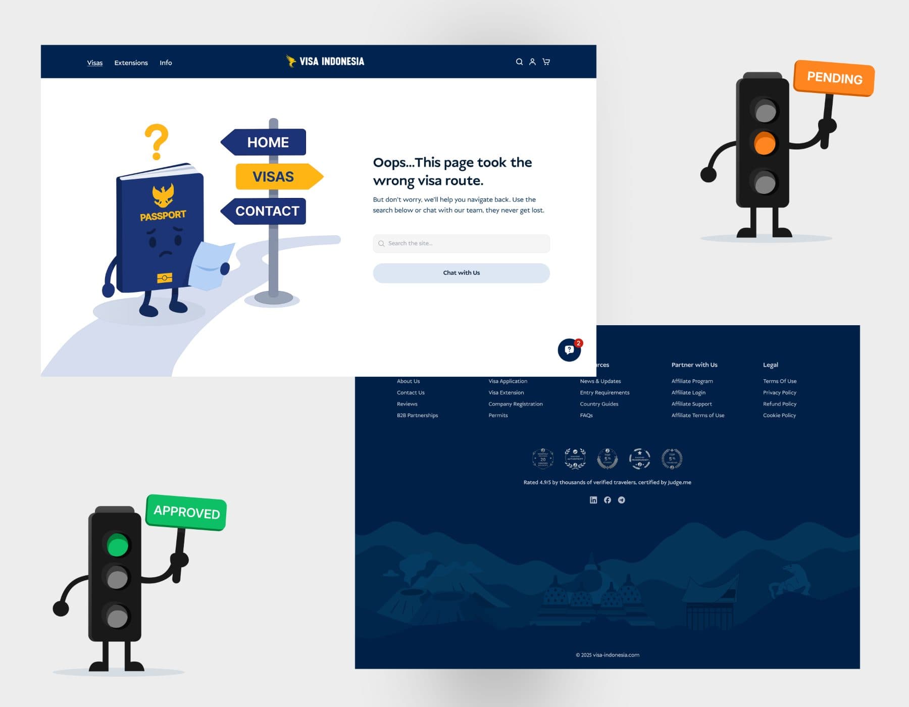
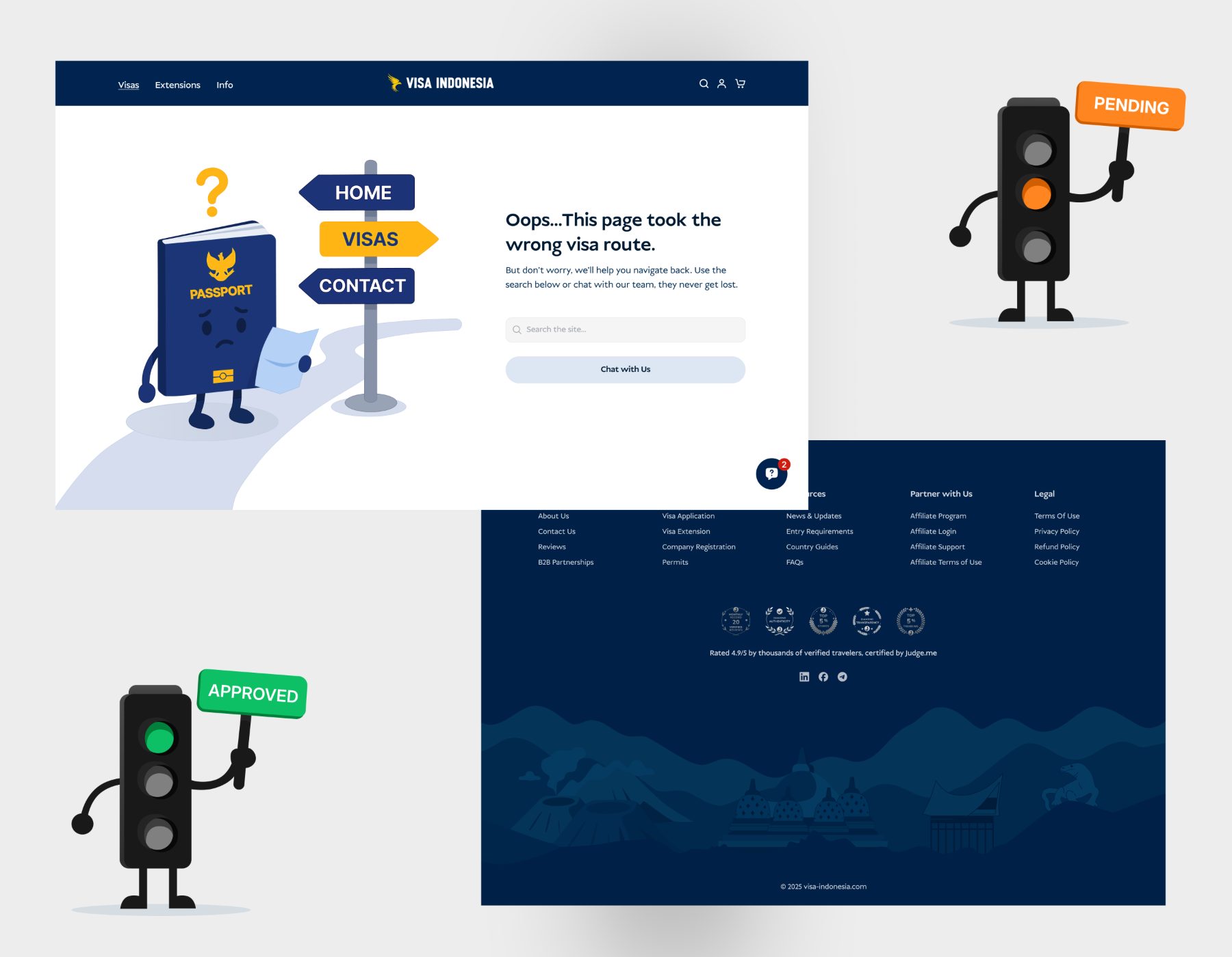
Visa Indonesia didn’t have any character in its old identity. I designed two custom mascots that became signature moments. A passport book mascot for the 404 page, lost on the wrong route. A traffic-light mascot for the affiliate auth states – pending, rejected, approved. Both turned moments that usually frustrate users into moments that soften the experience. The kind of detail users screenshot.
Restructured around how users actually search.
The old navigation buried services. Users couldn’t find KITAS or KITAP without hunting. Dropdowns listed every visa as flat text, making the user read every line to identify the right one. I restructured the navigation around four clear categories: Visa Applications, Visa Extensions, Other Services, Partner With Us. Inside each, visas are grouped by stay duration. Dropdowns now use thumbnails alongside text, so the user identifies their visa visually instead of reading every name.
Templated landing pages for SEO and conversion.
A visa services site lives by search. Someone Googling “tourist visa Indonesia from Germany” needs to land on a page that ranks, answers the question, and converts. I designed templated country landing pages so the same structure could carry every country the agency serves. A user from the UK and a user from Brazil land on different pages but get the same quality of answer – visa types, requirements, timelines, costs, FAQs, application CTA.
A Bali-soul footer.
I treated the footer as another moment to show what the brand actually loves about Indonesia. Custom illustrations using Bali elements: the temple silhouette, the Komodo dragon, faces from Indonesian culture. The footer became a closing argument for the brand instead of a list of links.
The operational backbone after checkout.
Visa applications don’t end at checkout. After payment, users fill out application forms, upload documents, track their order, and sometimes return to add more information. For users buying visas for multiple people, that tracking is even more important. I designed the portal as a clean dashboard built around the application lifecycle – place an order, fill the form across multiple steps with clear progress, track status, manage documents, update settings, change phone number when they switch SIM cards in Indonesia. Affiliates and B2B partners get the same shape of portal tuned to their work.
Transactional emails as part of the brand.
Most agency sites treat transactional emails as plumbing. I designed 15+ emails as part of the system – welcome, new login, password reset, order received, abandoned cart, order failed, payment refunded, review request. Every email carries the brand. The same went for the two PDFs that shipped – an internship visa info doc and a price list. My first time designing PDFs. Easy path would have been a styled Word doc. I designed both as proper branded artifacts so a B2B partner forwarding the price list internally is sending something that reinforces Visa Indonesia’s quality, not undermines it.
A full system – 30+ pages, 15+ emails, 50+ surfaces.
What shipped is a marketing website (30+ pages including homepage, About, Affiliate, Contact, Reviews, FAQ, Blog, All Services, KITAS, KITAP, eVOA vs eVisa comparison, B2B, country landing pages, eSIM, individual visa info pages, Visa on Arrival, Ads landing, Entry Requirements, Legal, 404, office locations, Honorable Visa, Partners, French localization, Other Services), a customer portal with multi-step application flow, 15+ transactional emails, two branded PDFs, custom mascots, social media templates, and a design system that holds it all together. The site supports 19 languages and 28 currencies, designed for localization from day one.
31,000+ customers. 4.9 across 1,951 reviews.
Visa Indonesia is live at visa-indonesia.com, serving over 31,000 customers with a 4.9 rating across 1,951 verified reviews. The project stretched me hardest around domain learning. I started knowing nothing about Indonesian visas and ended up understanding the space well enough to design a customer portal that handles a Digital Nomad Visa applicant the same way it handles a Spouse KITAP applicant, even though those are completely different kinds of users. The other stretch was scope – a homepage test that quietly grew into the entire system. The foundation built here led directly into the Digital Arrival Card platform and new product directions for the agency.