Zari: Making gifting more personal, online and in store.
Zari is a gifting platform that helps people discover, curate, personalise, and purchase gifts. Customers can build gift boxes from scratch, choose from ready-made collections, or purchase individual products. Beyond shopping, Zari also connects people through shareable gifting profiles, wishlists, and important dates.
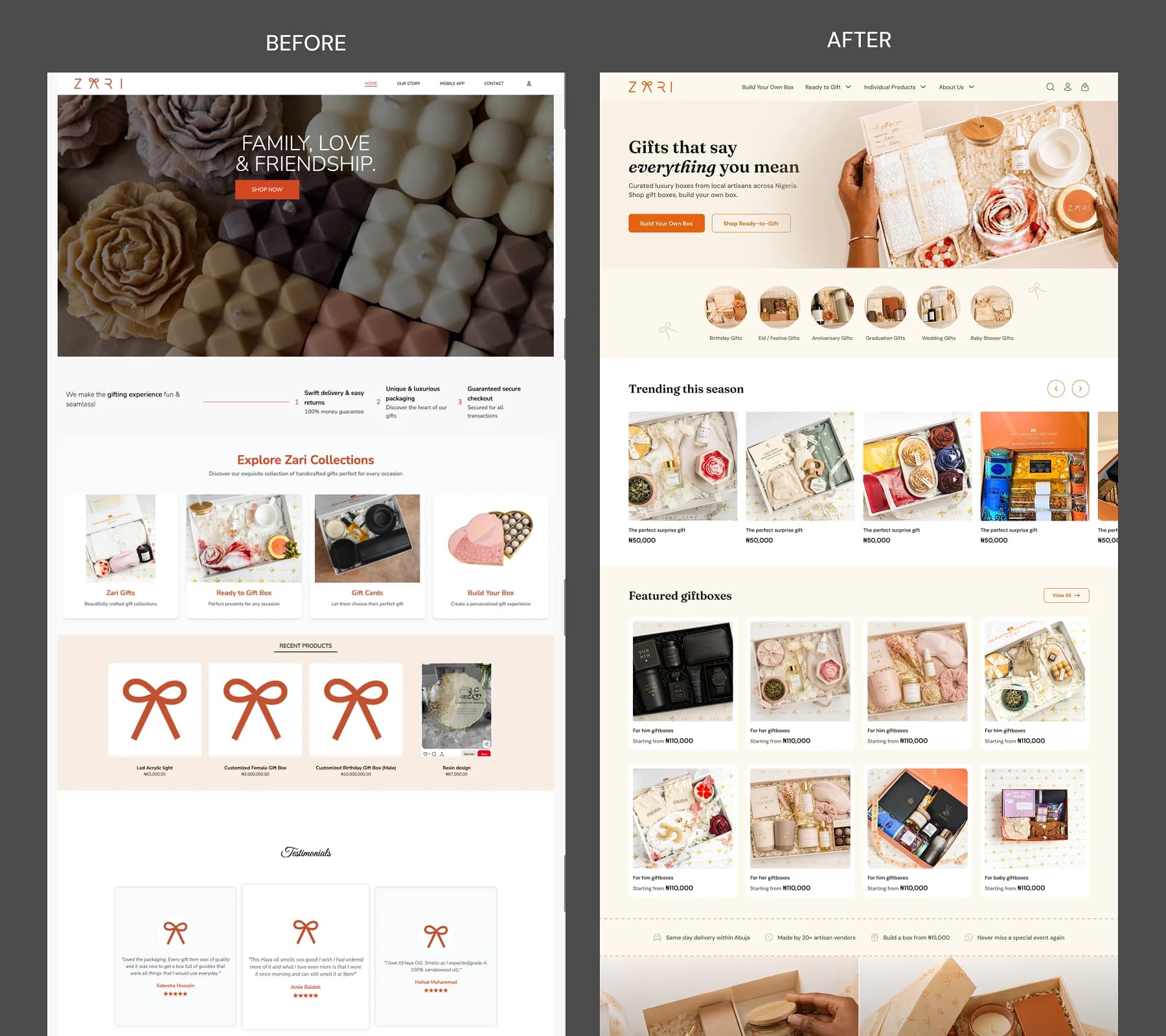
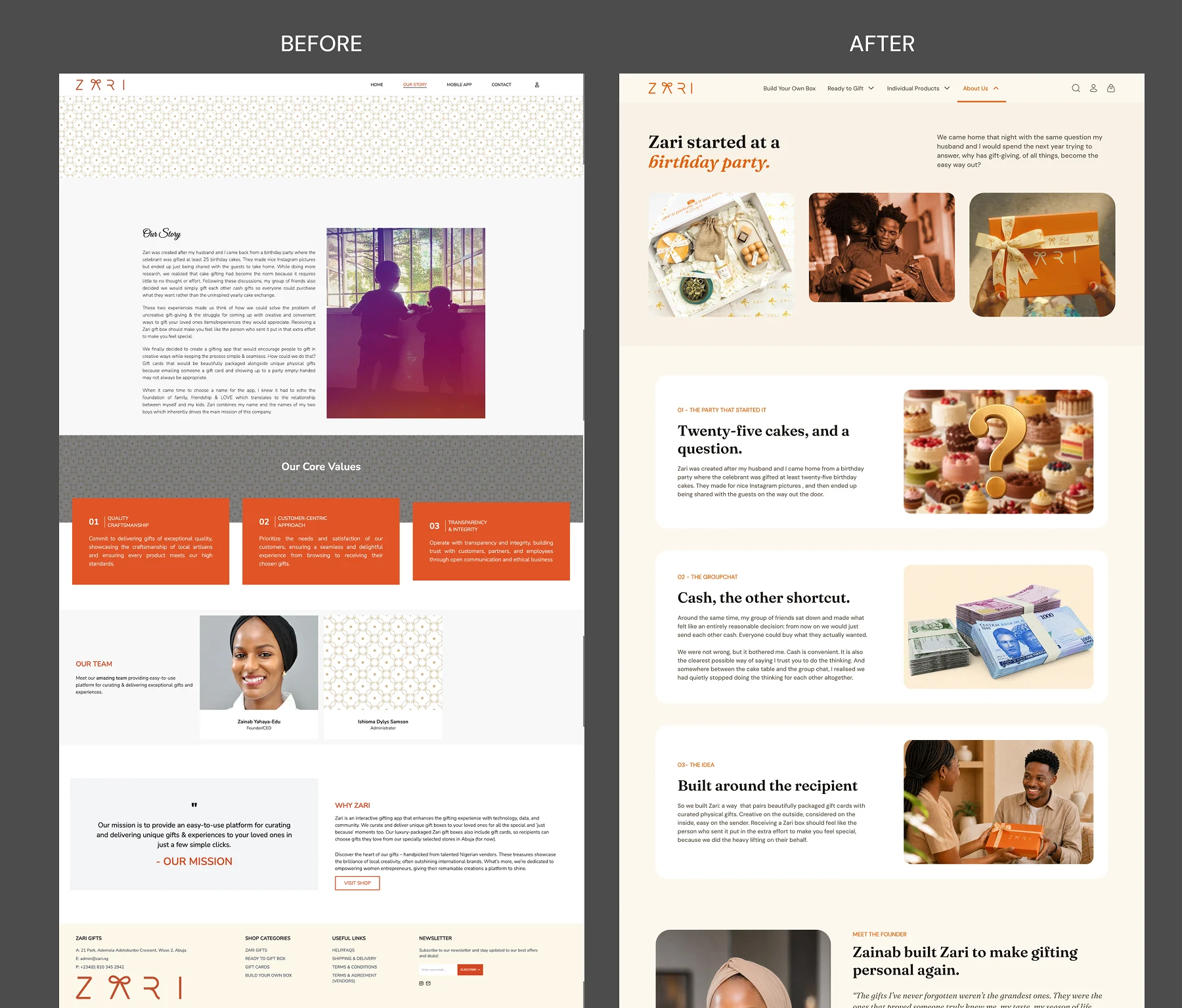
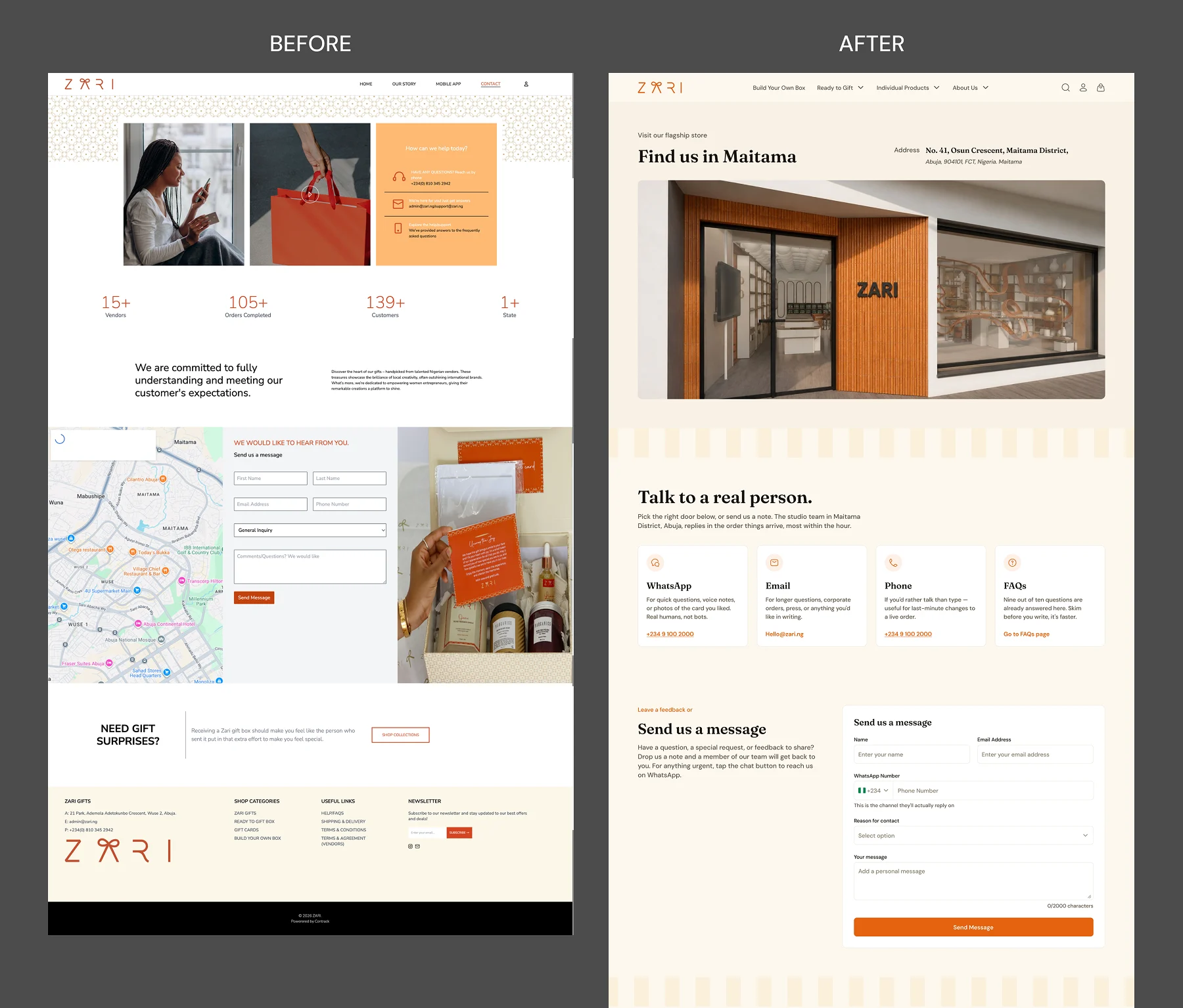
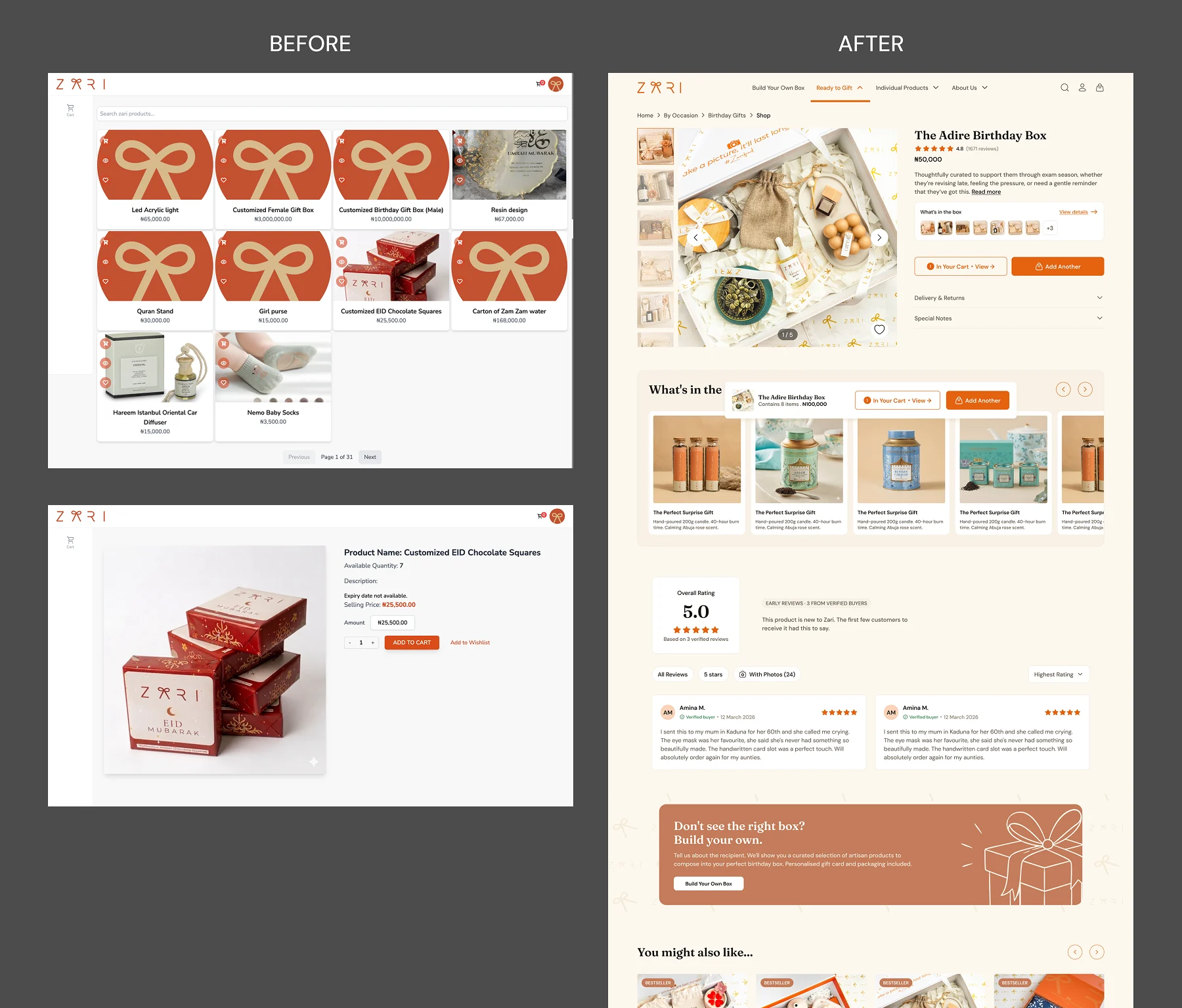
When I joined, Zari had an outdated website that was no longer functioning properly. Customers could browse products and add items to their carts, but couldn't reliably view product details or complete purchases. With a new physical store opening, the business needed a complete e-commerce experience and a self-service kiosk that would launch alongside it.
As the sole product designer, I owned the experience from user flows and interaction design to visual design, responsive layouts, prototyping, and developer handoff. I worked closely with the product manager, developers, and founder to refine requirements and bring the product to launch.
The challenge was bringing several different gifting journeys together into one experience without making the platform complicated to use.
The Challenge
One platform, different ways to gift.
Zari needed to support three different shopping experiences: Build Your Own Box (BYOB), Ready to Gift (RTG), and Individual Products.
Each worked differently. BYOB let customers create a gift from scratch, RTG offered pre-curated gift boxes, and individual products followed a more conventional shopping experience. But customers needed to be able to purchase all three through the same cart and checkout.
The platform also needed a Community experience where people could share their preferences, connect with others, and make gifting decisions based on what someone actually likes.
I started by mapping the different journeys and identifying where they needed unique interactions and where they could share the same structure. I also researched gifting platforms, particularly My Treat Box, which the founder had identified as a benchmark. This helped me approach Zari as a connected product rather than a collection of independent features.
The Cart
One cart, different behaviours.
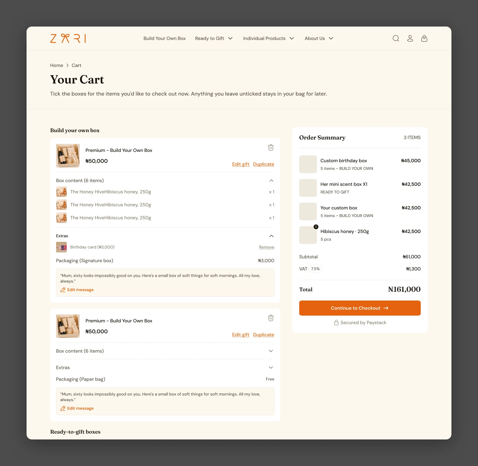
A typical e-commerce cart treats most products the same way, but that approach wouldn't work for Zari. A custom gift box could contain several products, extras, packaging, and personalisation details. A ready-made box had fixed contents, while individual products needed standard quantity controls.
I organised the cart into clearly labelled sections for BYOB, RTG, and Individual Products, letting customers distinguish their purchases without separating them into different carts. For custom boxes, I introduced expandable sections where customers could review the selected products, quantities, extras, and packaging. They could also edit their gift message, return to the builder to make changes, duplicate the box, or remove it.
Ready-to-Gift boxes had fewer editing actions because their contents were already curated, while individual products kept conventional quantity controls.
Making custom gifts easier to manage
I deliberately used Duplicate instead of a quantity selector for custom gift boxes. Someone ordering several boxes might want the same products but different messages or personalisation for each recipient. Duplicating a box made it possible to reuse the configuration while keeping each gift independent.
I also introduced contextual naming based on the occasion selected during gift creation. Instead of showing every custom gift as "Build Your Own Box," customers saw names like Custom Birthday Box or Custom Anniversary Box. If no occasion was selected, the system used a fallback such as Custom Box 1. These decisions helped customers manage multiple gifts without losing track of what belonged to each one.
Checkout
Collecting only what's needed.
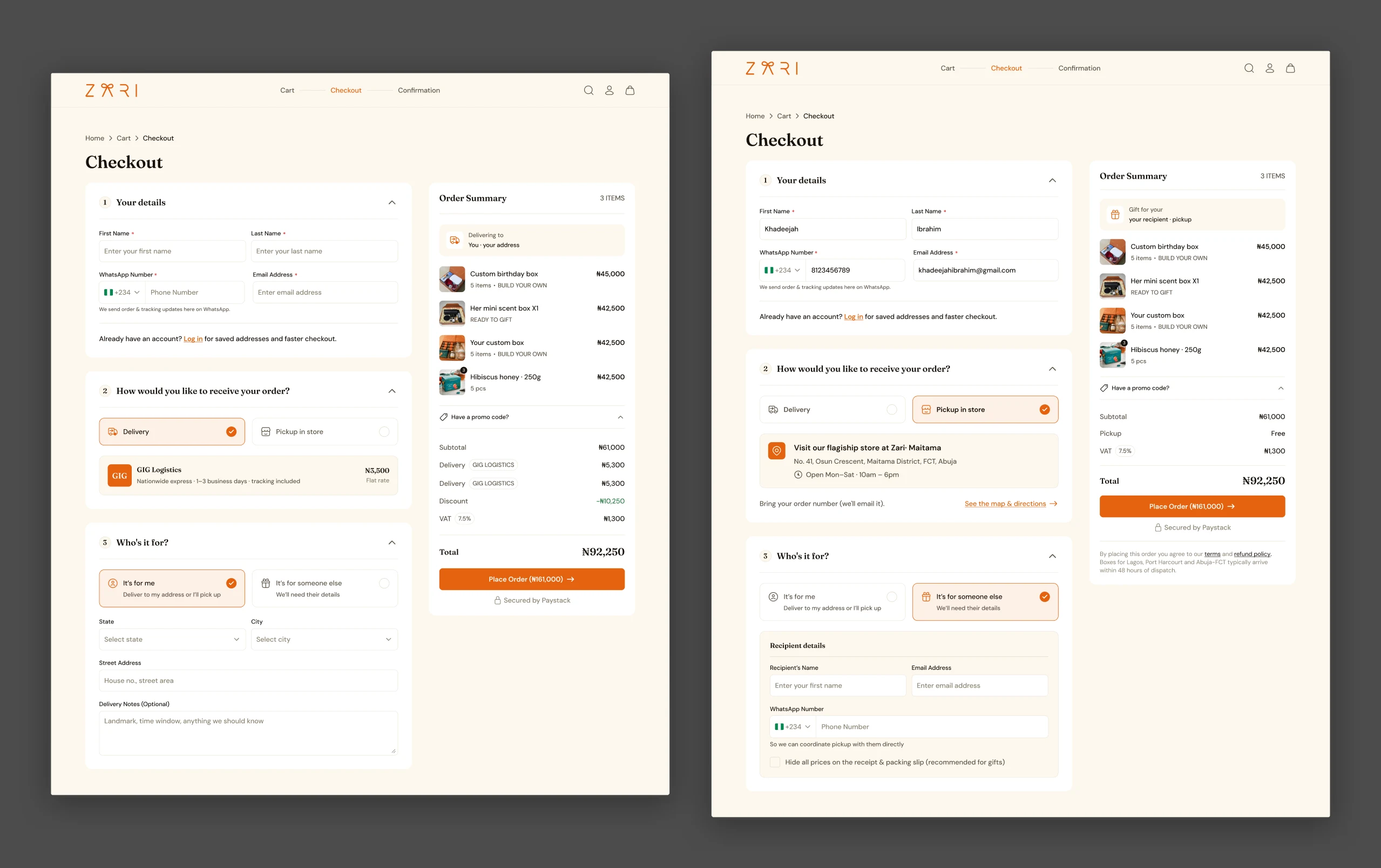
Checkout introduced another layer of complexity, because Zari supported guest and logged-in customers, delivery and pickup, and purchases for oneself or someone else.
Rather than presenting everyone with the same form, I structured checkout around three decisions: who is placing the order, how they want to receive it, and who the order is for. The customer's selections determined which fields appeared. Someone collecting their own order didn't need a delivery address, while someone sending a gift needed the recipient's contact and delivery information.
Logged-in customers could reuse saved information, while guests could complete their purchase without signing up first, with an account created from the email they provided. I also accounted for Zari's fulfilment model: customers could buy different gift types together, but gifts for different recipients or fulfilment arrangements required separate checkouts.
The result was a checkout that adapted to the customer's situation instead of asking everyone to complete unnecessary fields.
Build Your Own Box
Breaking a detailed process into manageable steps.
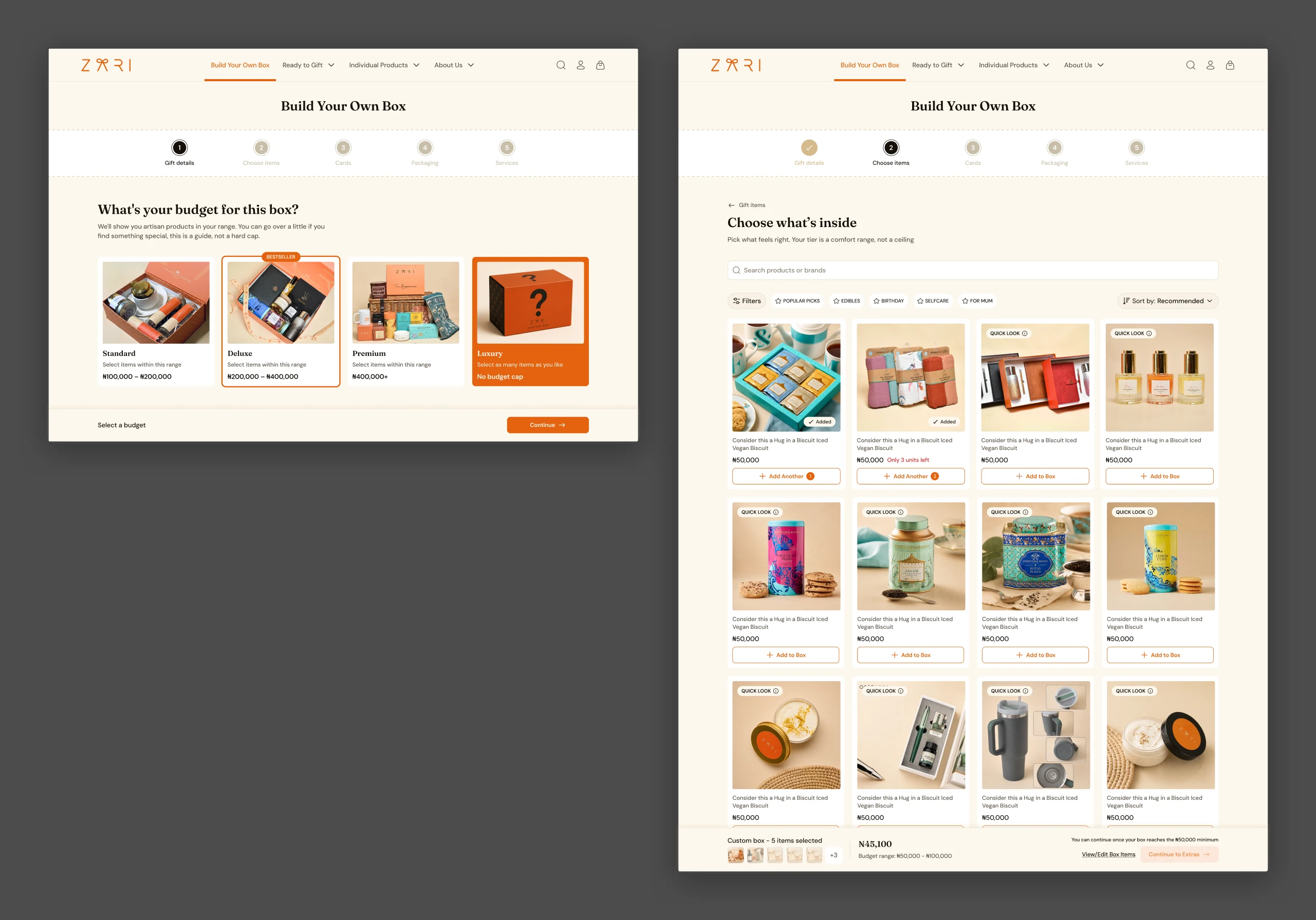
Build Your Own Box was one of the most complex journeys, because customers were creating a gift rather than selecting an existing product. They needed to set a budget, choose products, add extras, select packaging, and potentially personalise individual items.
The flow went through several iterations as we refined how these decisions should be grouped. An earlier version had four stages, but the introduction of personalisation services made it necessary to reconsider the structure. I eventually settled on five steps:
- Gift Details: budget, recipient, occasion, and preferences.
- Choose Items: the products that go inside the gift box.
- Add Extras: optional additions such as greeting cards.
- Packaging: how the gift should be packaged.
- Services: optional personalisation on eligible products or packaging.
Two decisions were particularly important. First, I proposed Extras instead of Cards, because Zari could eventually introduce other additions, like customised keychains or mugs. The broader name let the step accommodate future offerings without changing the flow.
Second, I placed Packaging before Services, because customers needed to choose their packaging before deciding whether to personalise it. I also treated the selected budget as guidance rather than a restriction: customers got a warning when they exceeded it, but could keep adding products.
The final structure made the process easier to follow without removing the choices that made custom gifting valuable.
Personalisation
Different items, different instructions.
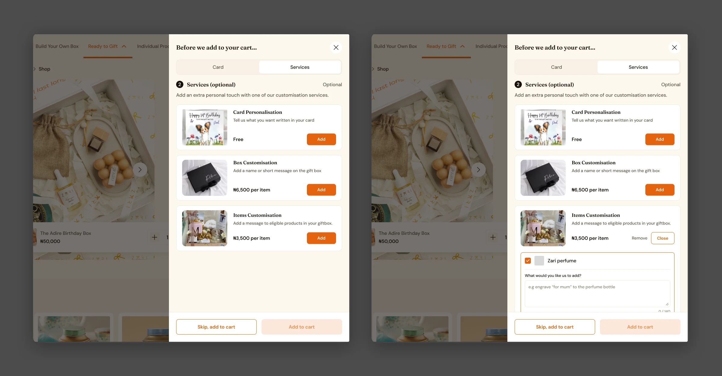
Personalisation services were introduced later in the project, shortly before launch. Zari wanted customers to customise individual products within their gift boxes, but a customer might select several eligible products and want different instructions for each.
Rather than making customers repeatedly enter and exit the same service, I designed an interaction where they could select multiple eligible items and provide separate instructions within one flow. Someone could request a name on a tumbler and different initials on a bathrobe without treating both as one general instruction.
I also separated personalisation instructions from gift messages, because they serve different purposes: one tells Zari how to customise an item, the other is meant for the recipient. This let customers personalise multiple products without repeating the same process. The final interaction was implemented as designed.
Community
Helping people know what someone actually wants.
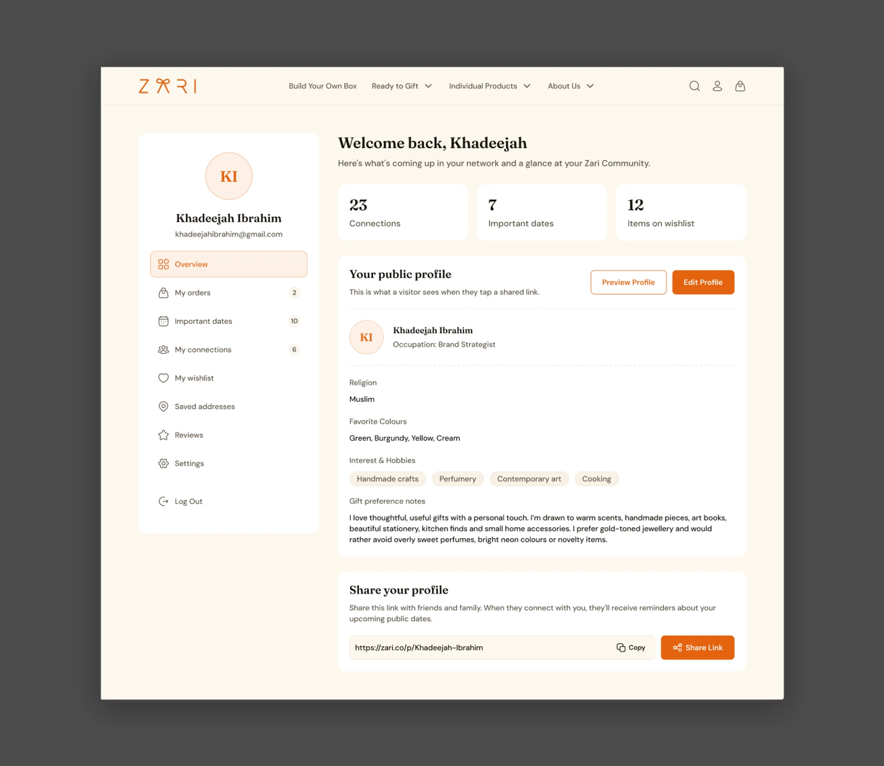
Zari wasn't meant to be only a place where people purchased gifts. The platform also wanted to help customers discover what others would appreciate and remember important occasions. I designed a Community experience where customers could create shareable gifting profiles, manage connections, save important dates, and keep wishlists. The challenge was bringing these features together while making them accessible to both existing customers and people who had never used Zari.
Making profiles accessible without an account
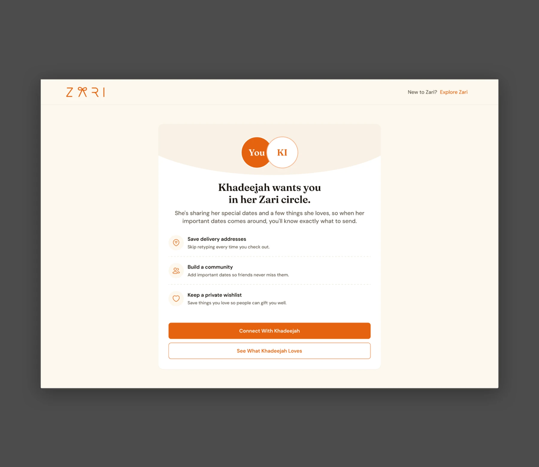
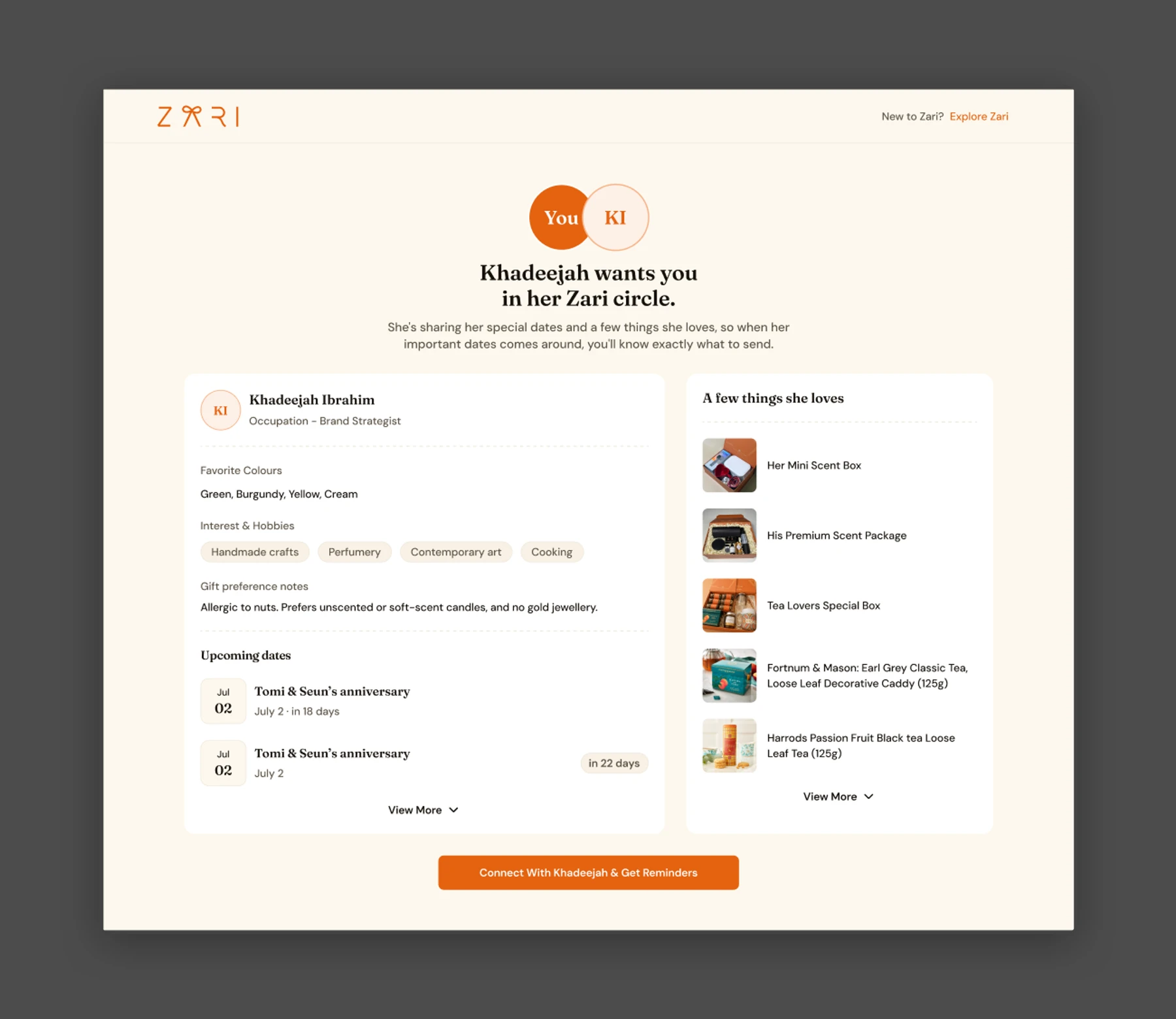
Customers could share their public profiles through a link, letting anyone explore their interests, favourite colours, occupation, gift preferences, and wishlist without signing in. I designed a dedicated entry experience for visitors opening these links. Someone might see "Khadija wants you in her circle", with the option to connect with Khadija or see what she loves, so they could find a suitable gift without being required to create an account first.
Designing connections for different users
The connection flow adapted depending on whether someone already had a Zari account. Existing customers could connect directly, while new visitors provided their first name, last name, and email. Within Community, signed-in customers could manage connections, view profiles, see shared upcoming occasions, and discover gifts for specific people. I wanted customers to be able to start with the person they were gifting, rather than always beginning with a product search.
Connecting wishlists and important dates
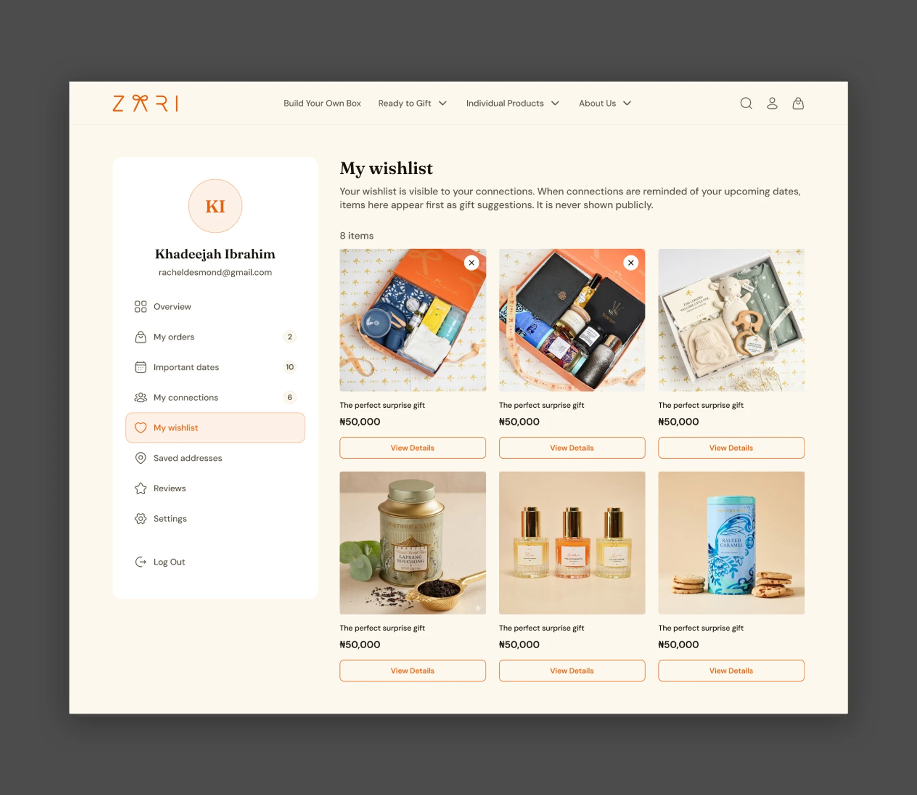
Wishlists served a broader purpose than simply saving products for later. Customers could add items they wanted, and other people could discover and purchase those items through their shared profiles. Important Dates let customers save birthdays, anniversaries, and other occasions, including custom events, and choose which dates were visible to their connections. Together, these features helped people understand someone's preferences and remember when to celebrate them.
Organising the Community experience
Community also needed to hold orders, saved addresses, reviews, settings, and other account features. I organised these within a sidebar layout, with the customer's profile overview as the default page, giving users a central place to manage their gifting activity without overcrowding the main shopping navigation.
The larger goal was to make Zari useful before someone even started shopping, by connecting gifting to the people and occasions behind it.
Orders
Preserving the gift beyond the purchase.
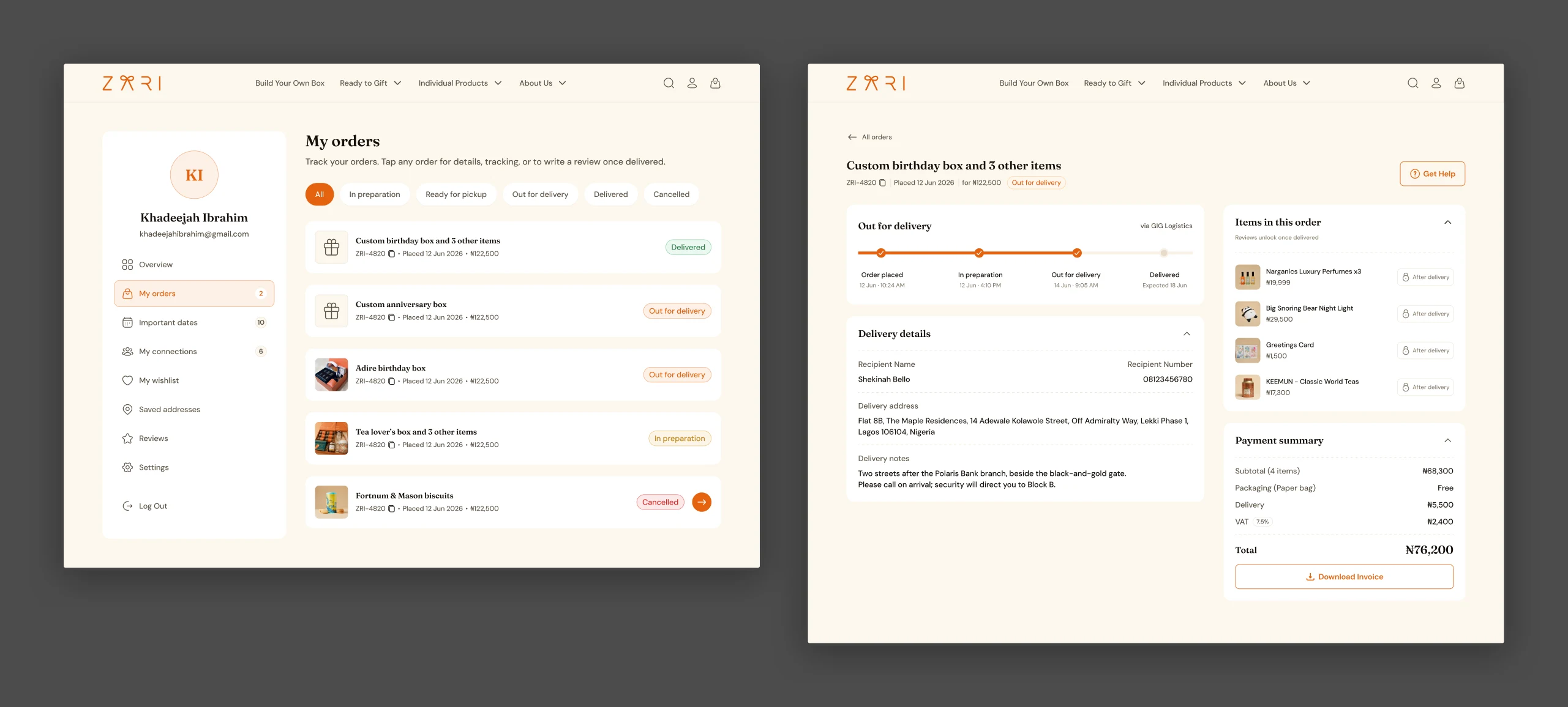
The different gift types also needed to stay understandable after checkout. A custom gift box should still appear as one gift, rather than a disconnected list of products. Customers also needed to review their purchases, track progress, and reorder gifts when needed.
I carried the same grouping logic from the cart into order details, so customers could recognise what they'd purchased. Because Zari fulfilled purchases from its own inventory, products within a custom box didn't need individual fulfilment statuses: the order followed a shared status, with different progress paths for pickup or delivery. The experience supported statuses such as In Preparation, Ready for Pickup, Out for Delivery, Delivered, and Cancelled.
I also designed the reorder experience so customers could select specific gifts or items from a previous order rather than buying everything again. This kept the experience consistent beyond checkout and made repeat gifting more flexible.
The Kiosk
Designing for a self-service kiosk.
Alongside the website, Zari wanted a self-service kiosk at its new physical location. This was my first kiosk project, so I researched screen dimensions, touch targets, interaction patterns, and other considerations specific to shared touchscreen devices.
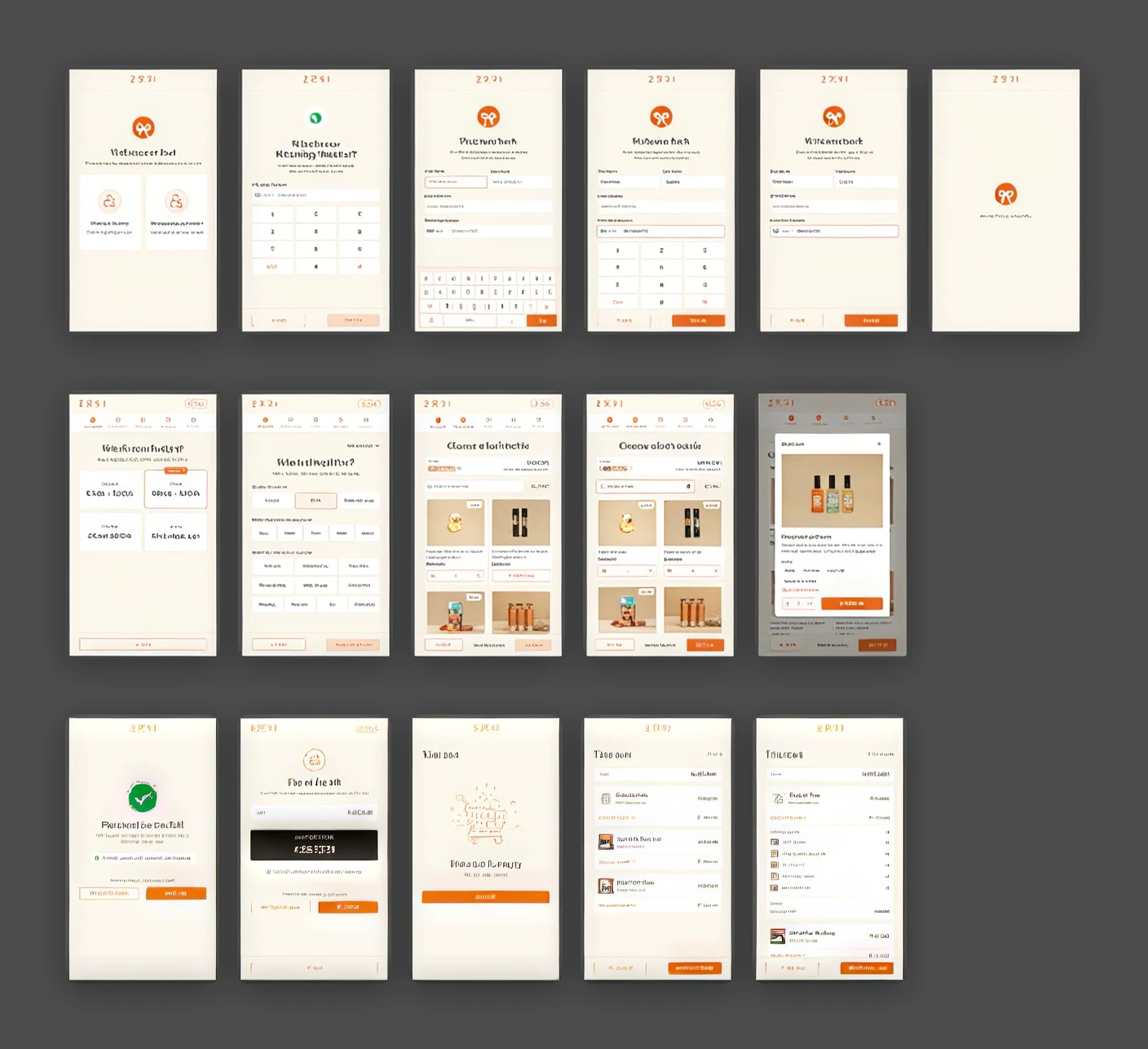
The kiosk used a 1080 by 1920 portrait display and focused on two journeys: Build Your Own Box and Ready to Gift. Rather than simply enlarging the website, I adapted the experience for customers interacting with a large touchscreen while standing in-store.
Accounting for abandoned sessions
Unlike a personal device, a kiosk is shared by different customers throughout the day. I designed an inactivity timer that warned customers before their session expired. If they didn't continue, the session reset so the next person could start fresh. This mattered because customers entered their contact details when beginning a session, and abandoned sessions shouldn't remain open for other shoppers.
Supporting in-store payments
Customers could pay by bank transfer, with account details shown on the kiosk, or pay cash at the counter. The interface needed to communicate what would happen next, since part of the payment process took place off-screen. The kiosk experience was implemented and launched alongside the website.
Visual System
Making the platform feel like Zari.
Zari already had a brand identity, but turning it into a full digital experience took more decisions, mostly around the signature orange. The founder wanted a shade that reflected the physical store, but the original was too bright for heavy use across an interface, so I settled on a tone that stayed true to the brand while working better on screen.
I also standardised product imagery, with a clean cream background for individual products and a packaging-inspired one for gift boxes, and carried the same direction into illustrations for occasions, categories, and interface states, so the whole platform felt like one thing.
Launch & Reflection
From an outdated website to a connected gifting platform.
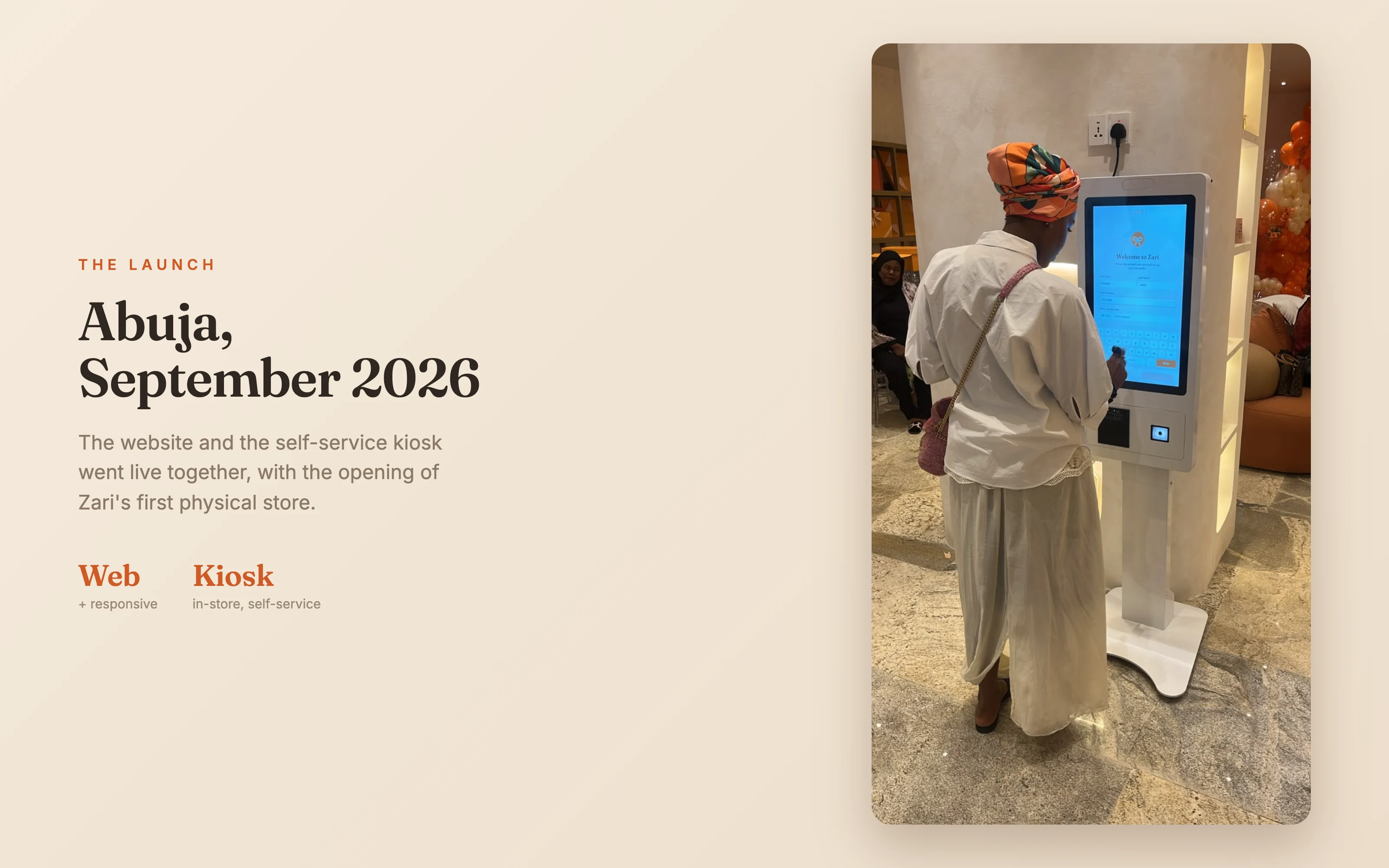
Zari launched its new website and self-service kiosk in late September 2026, alongside the opening of its new physical location. The platform brought together three shopping journeys, a guided gift-building experience, personalisation services, and a Community space where people could discover gifts through relationships and shared preferences.
One of the most rewarding moments was seeing customers interact with the kiosk during launch. The founder was also extremely pleased with the final experience and repeatedly expressed appreciation for how the product had come together. I don't currently have quantitative data on conversion or engagement, so I can't attribute measurable business improvements to the design, but seeing the platform launch and customers use it was a meaningful outcome.
What I learned
Zari was my first complete e-commerce platform and my first time designing for a self-service kiosk. At first the scope felt overwhelming, because there were several different journeys, each with its own requirements. As I worked through it, I realised the hardest part wasn't designing individual screens. It was understanding how decisions in one part of the product affected everything else: the way a custom gift was created influenced how it appeared in the cart, the information collected during checkout determined how the order would be fulfilled, and Community introduced another way to discover gifts, starting with people rather than products.
If I approached a similar project again, I'd map these shared structures and the more complicated edge cases earlier, particularly where different journeys depend on the same information.
The biggest lesson I took from Zari was that designing a complex product isn't about making every journey identical. It's about understanding where experiences need to differ, where they need to connect, and how to make the overall experience feel simple.