Àwùjọ: Structured Yorùbá learning for real progress.
Àwùjọ is a Yorùbá learning platform for people around the world, from diaspora learners reconnecting with their roots to complete beginners, researchers and anyone looking for a structured way to learn the language.
Behind the experience is a rich learning model: five proficiency levels, eight curriculum focuses per level, live tutors, private lessons, group cohorts, conversation practice and activities between classes. My job was to turn that complexity into a digital experience that felt clear to someone arriving for the first time, without losing the cultural warmth that made Àwùjọ distinct.
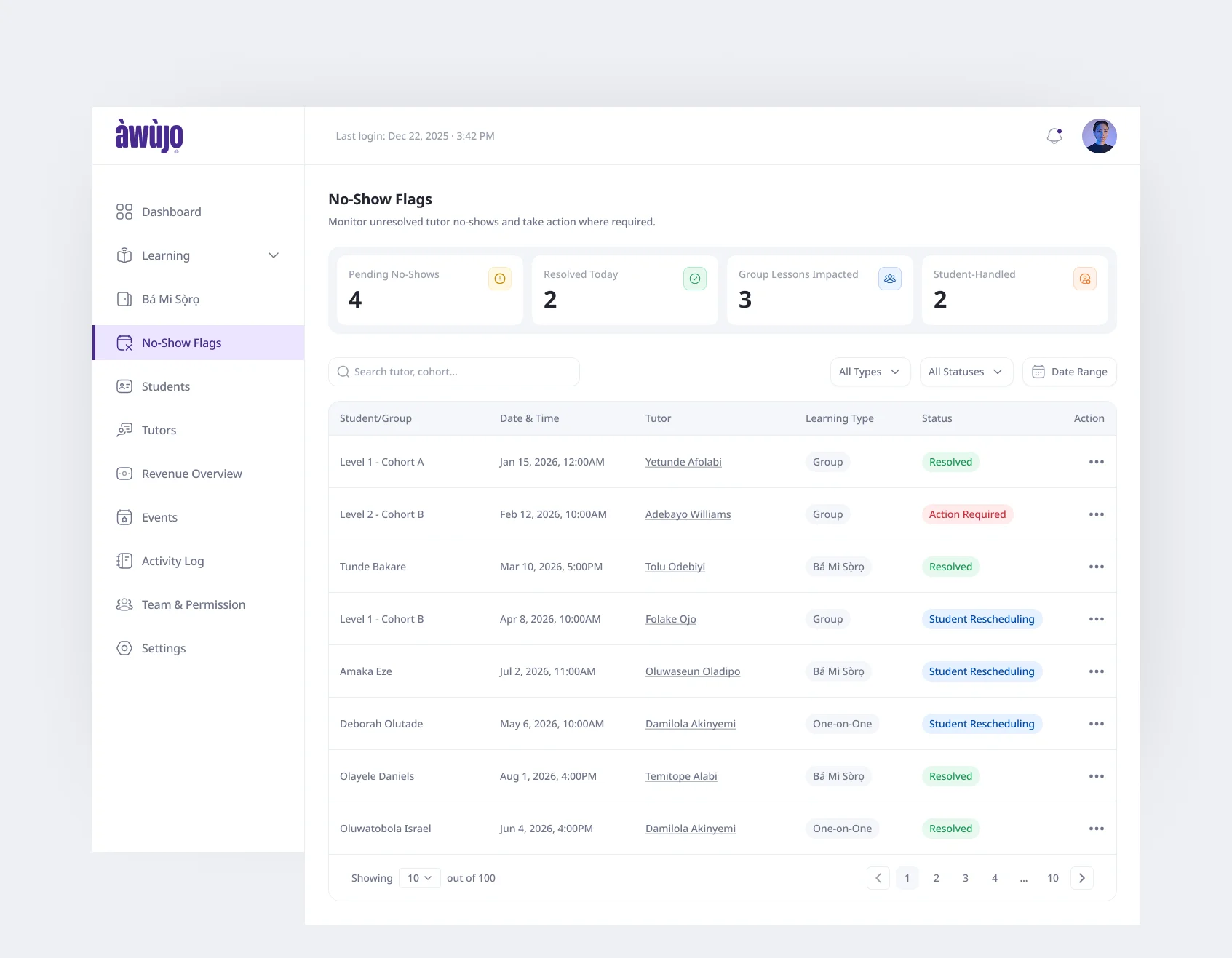
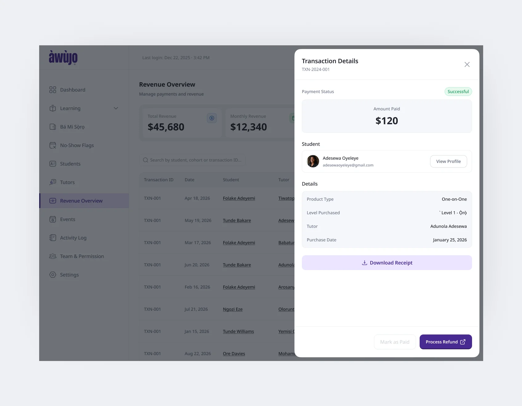
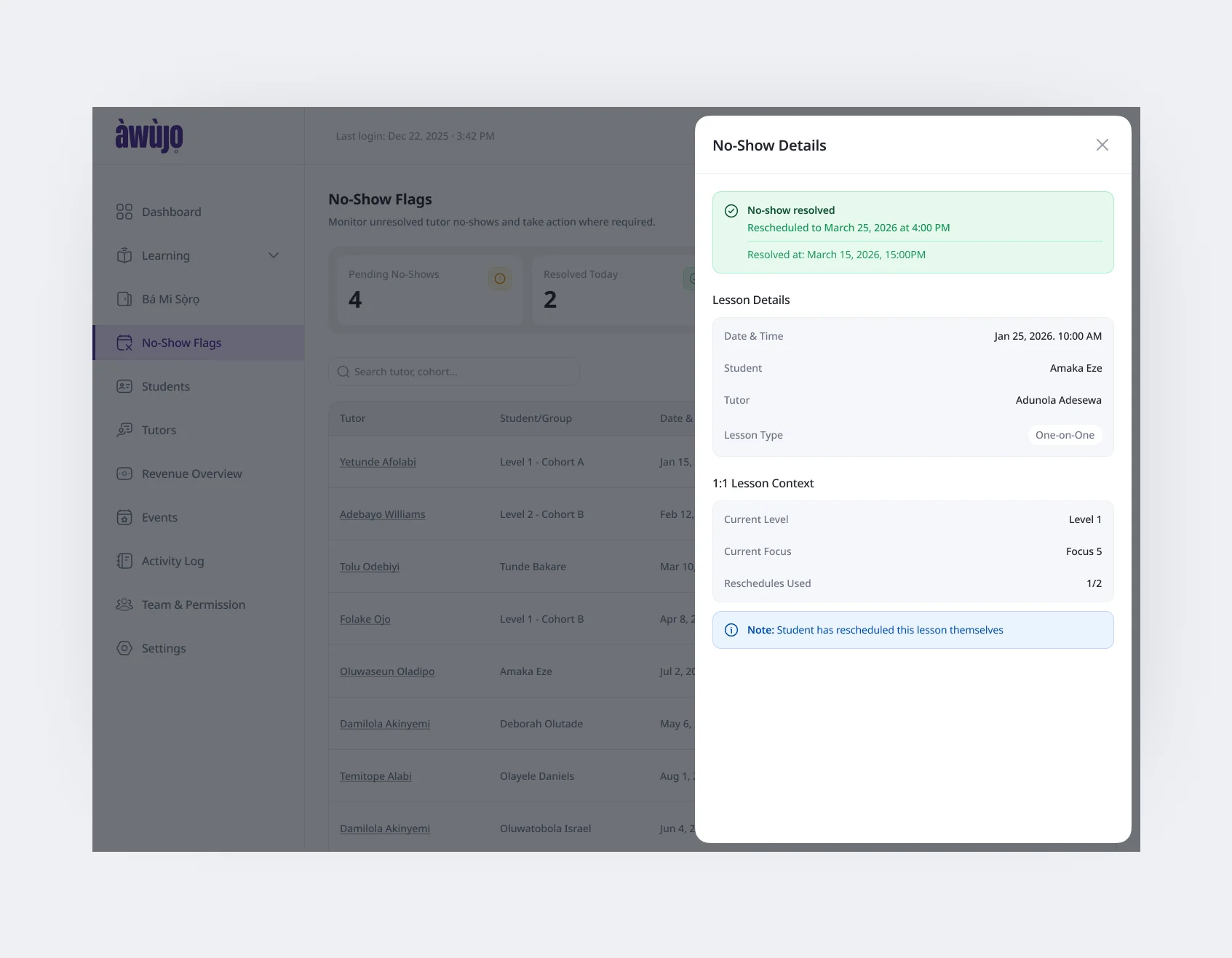
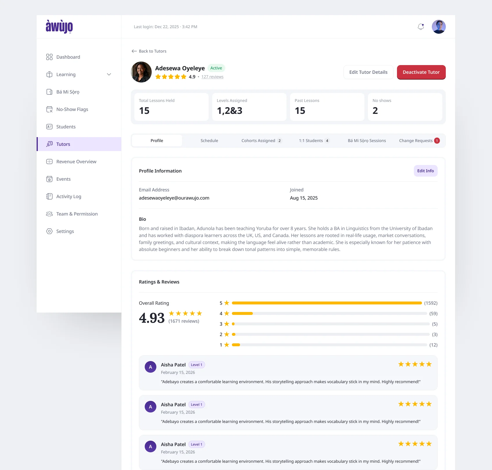
I led research and creative direction, designed the marketing website and student experience end to end, and reviewed the tutor and admin experiences designed by the junior designer on the team.
The Challenge
Language learning platforms tend to fall into two camps. Gamified apps that feel fun but don’t take you anywhere serious, or traditional online schools that feel like homework before you’ve started. Àwùjọ’s goal was to be structured enough that learners actually progress through real proficiency levels, and warm enough to feel like Yorùbá itself.
Àwùjọ’s teaching model made sense operationally, but translating it directly into software exposed a lot of complexity.
Before taking a class, a learner could already encounter lesson types, five proficiency levels, eight focuses within each level, tutors, cohorts, lesson packs, placement, scheduling rules, homework and recordings.
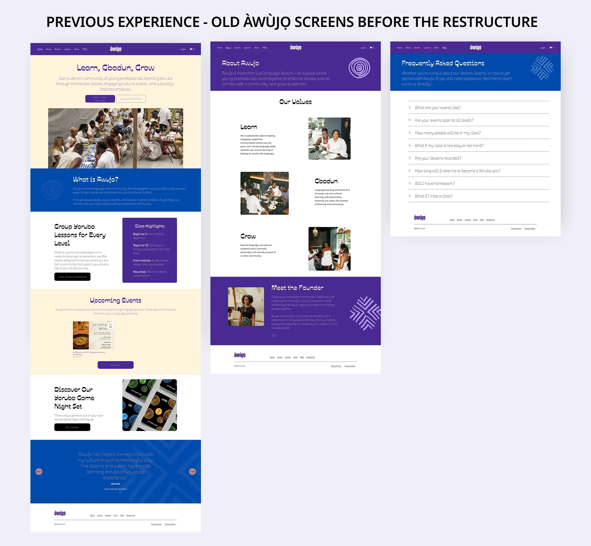
The initial direction reflected too much of that internal structure. I needed to find a simpler mental model for learners while still preserving the rules the business needed to run classes properly.
Solution
Starting with the learner’s first point of entry.
Àwùjọ needed four connected surfaces: a marketing website, student portal, tutor portal and admin portal. Each had a different role, but for learners, the journey always began in the same place, the website.
Unlike a typical product with a Sign Up or Create Account entry point, Àwùjọ only gives a learner access to the student portal after they purchase a lesson. That meant the website had to do more than explain the product: it had to help someone understand how Àwùjọ works, choose the right learning option, establish their level and feel confident enough to enrol.
So I started by mapping that first journey:
Landing Page → Choose How to Learn → Select a Level or Take the Placement Test → Choose a Tutor or Cohort → Purchase → Enter the Student Portal
This became the first layer of the experience I designed. Once the learner crossed that purchase threshold, the design problem changed from “How do I get started?” to “How do I keep learning?”, which shaped the student portal that followed.
Typography
A typeface could look perfect and still fail the product.
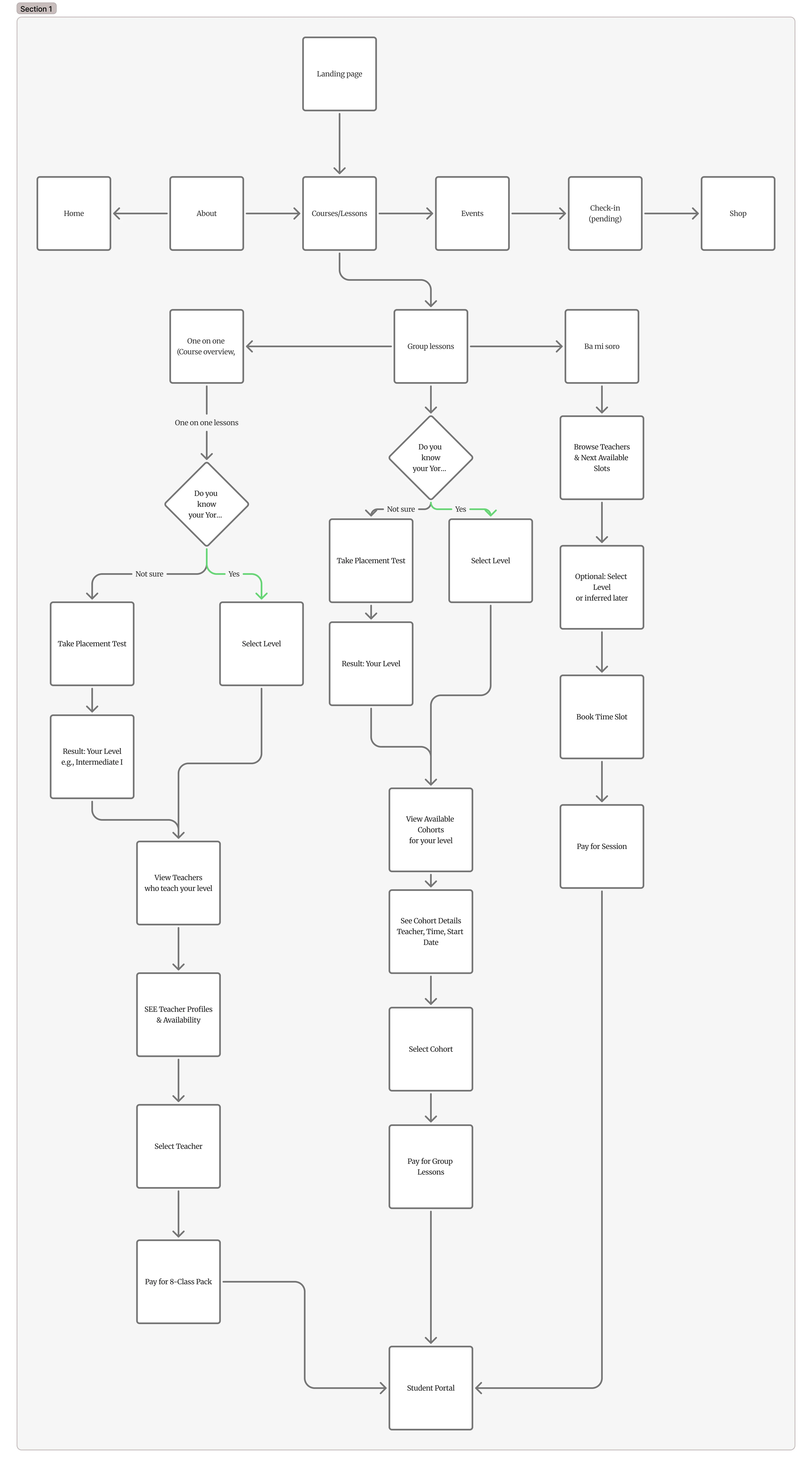
Typography became a functional constraint. Yorùbá relies on subdots and tone marks, and several fonts I explored either lacked the required glyphs or produced awkward combinations when multiple marks appeared on the same character. So I tested type using real Yorùbá words instead of relying on English placeholder copy.
After exploring several options, I settled on Fraunces + Noto Sans, a pairing that gave the brand the warmth I wanted while reliably supporting the language across the website and student portal.
Language choices went through a similar process. Terms such as Placement Test, Level, Focus and Lesson had to balance the internal learning model with terminology that would still make sense to someone encountering Àwùjọ for the first time.
Visual Direction
Giving a bold brand room to breathe.
Àwùjọ already had a bold palette built around saturated purple, orange, blue and yellow. My first explorations either gave those colours too much visual weight or pulled them back so far that the product lost its personality.
The breakthrough was introducing a light cream base. It gave the stronger brand colours somewhere to breathe and allowed them to appear throughout the product as accents rather than constantly competing for attention. More generous whitespace helped create the same balance.
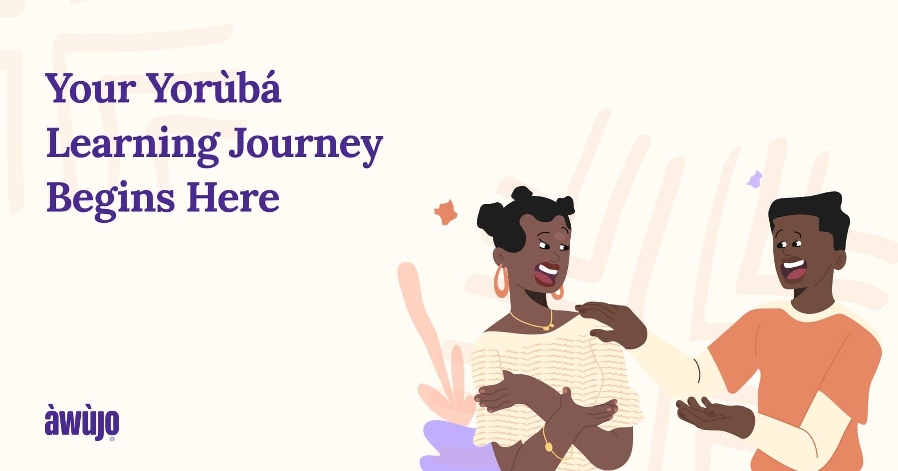
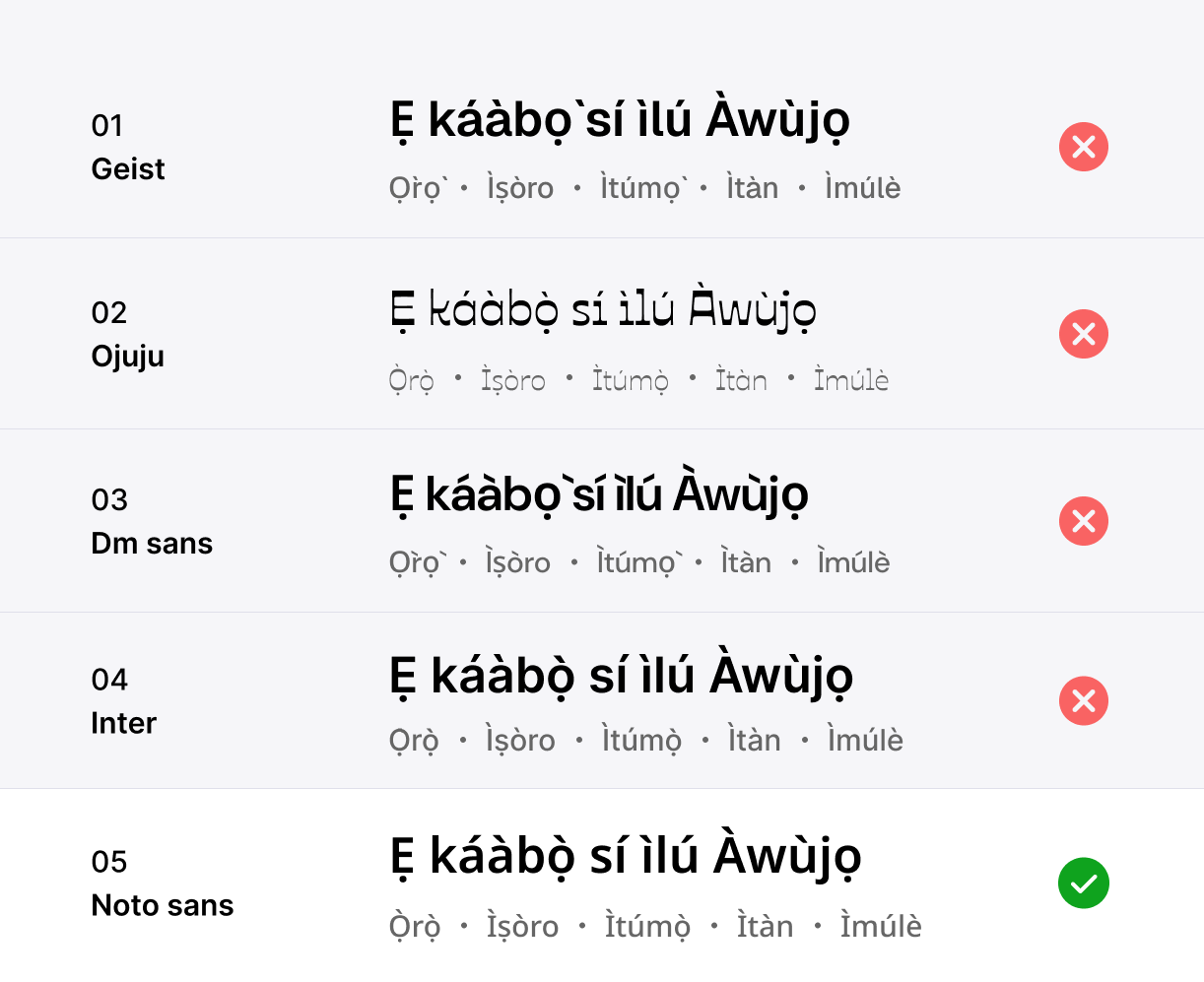
Illustration then became the connective tissue. It wasn’t part of the original brief, but I felt a Yorùbá learning product needed something more expressive than type and photography alone. I generated placeholder illustrations and designed them directly into the screens so the client could judge the direction in context rather than from a separate moodboard. The direction was approved, and an illustrator was brought in to create the final artwork.
The Website
Landing, three lesson types, and a placement test that respects time.
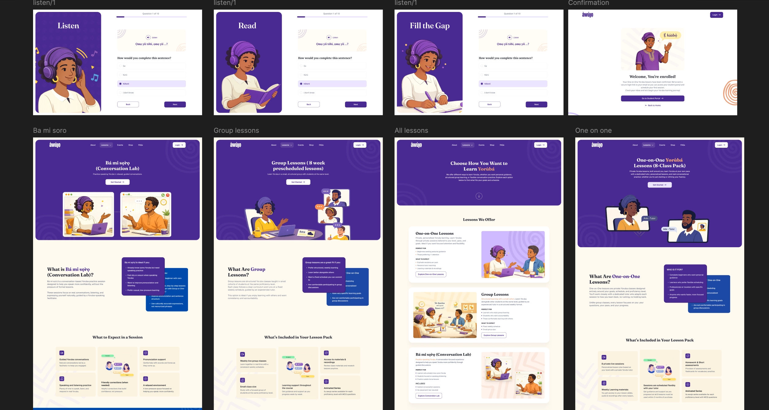
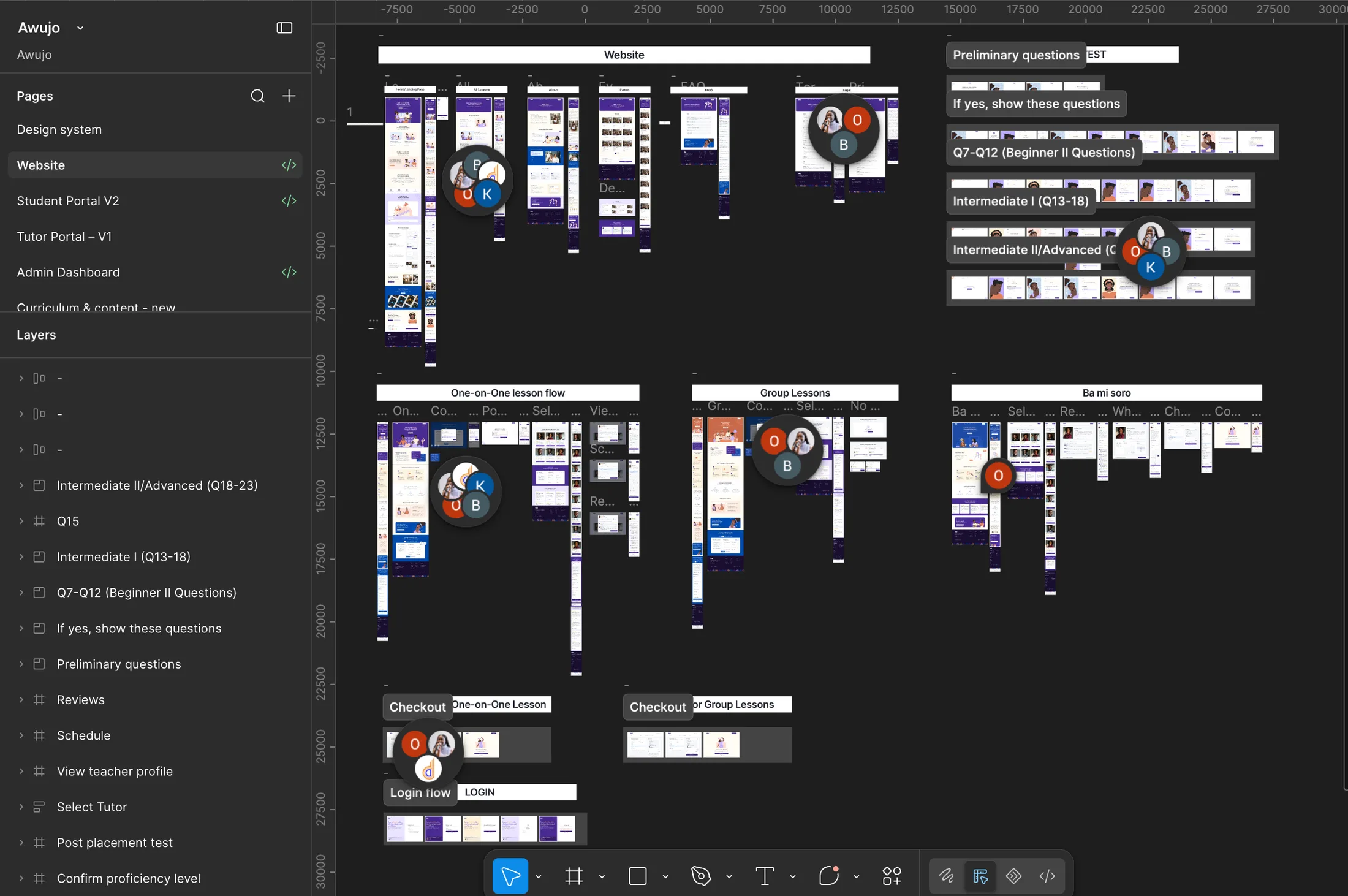
The website has a landing page, a lesson overview page showing the three offerings, and standalone landing pages for each of One-on-One, Group Lessons, and Bá Mi Sọ̀rọ̀. Plus Events, About, FAQ, the legal pages, and the full placement test flow.
Placement Test
Four question types. Up to 23 questions. Only four visual patterns to learn.
Àwùjọ’s Placement Test adapts as the learner moves through it. Someone with no prior Yorùbá knowledge can finish almost immediately, while a more experienced learner may answer as many as 23 questions before receiving a recommended level. That made completion a design problem.
Rather than designing 23 isolated question screens, I created four reusable patterns around the different types of interaction:
Speak · Listen · Read · Fill the Gap.
Each pattern gives learners a familiar visual cue for what kind of interaction is coming next. Illustrations and layouts add enough variation to hold attention during a longer test, without requiring a completely new illustration and interaction model for every individual question. The result is a test that changes enough to stay engaging while remaining predictable enough that learners don’t have to relearn the interface as they progress.
Choose How To Learn
Choose how you want to learn before worrying about what “Level 2” means.
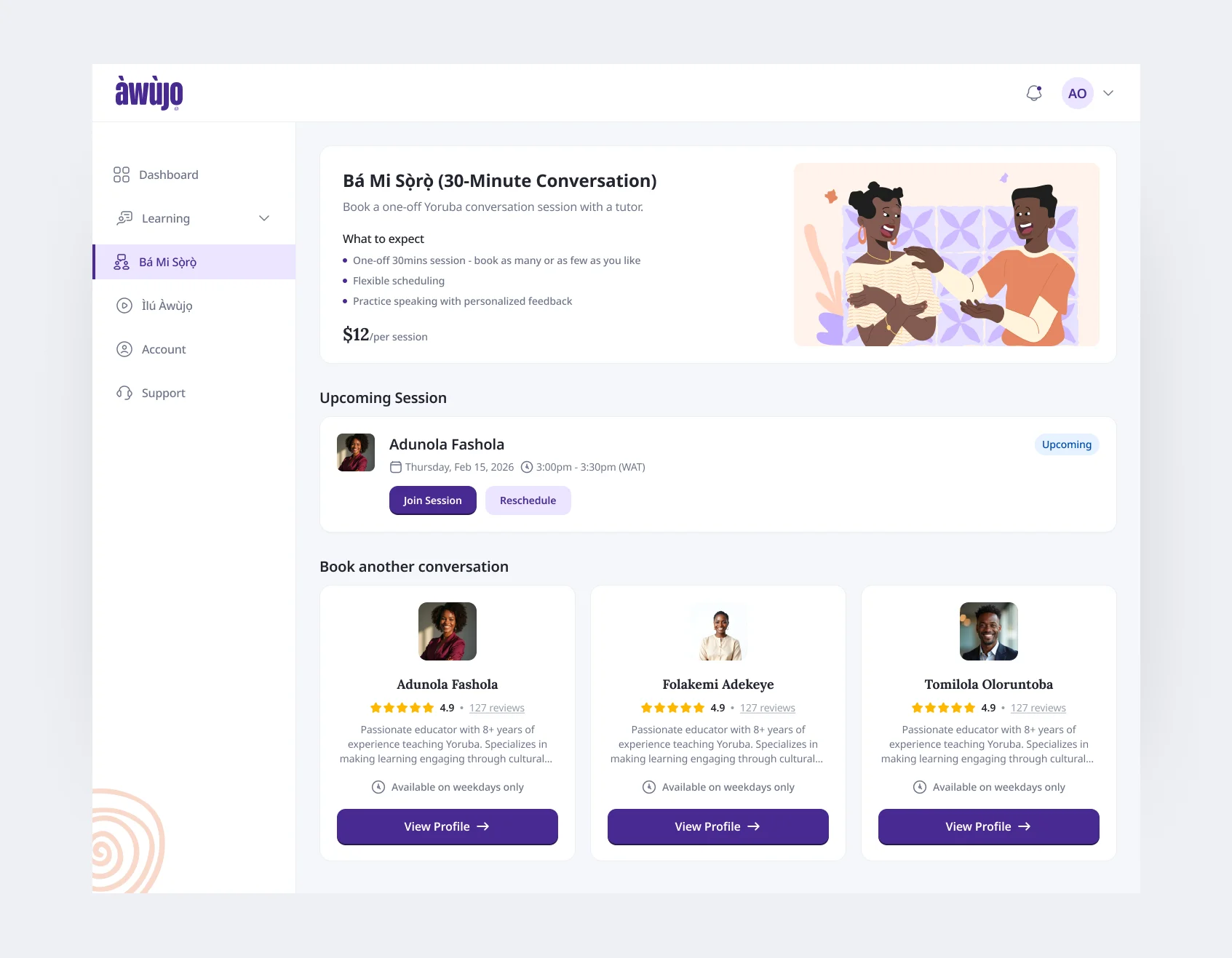
Àwùjọ has two structured lesson formats, One-on-One and Group Lessons, plus Bá Mi Sọ̀rọ̀, a 30-minute live conversation session for learners who simply want more speaking practice with a native speaker.
The earlier direction led heavily with proficiency levels. But new learners are often exactly the people least equipped to tell whether they’re Level 1 or Level 3, that’s what the placement experience is there to help determine. So I flipped the entry point around a decision learners could already make confidently: how they wanted to learn.
For private learning, the journey became: Choose One-on-One → select your level or take the Placement Test → compare tutors and availability → enrol.
Group learners instead see the cohorts, schedules and instructors available for their level, while Bá Mi Sọ̀rọ̀ stays intentionally lightweight as a flexible conversation-practice session.
Tutor Select
Keeping tutor comparison inside the flow.
For One-on-One lessons, I kept tutor details in a modal rather than sending learners into separate profile pages.
A learner can compare tutors, open a profile to see their background and availability, close it and immediately look at someone else, all without losing their place in the enrolment journey.
Student Portal + Progress Model
“Where am I?” turned out to have more than one answer.
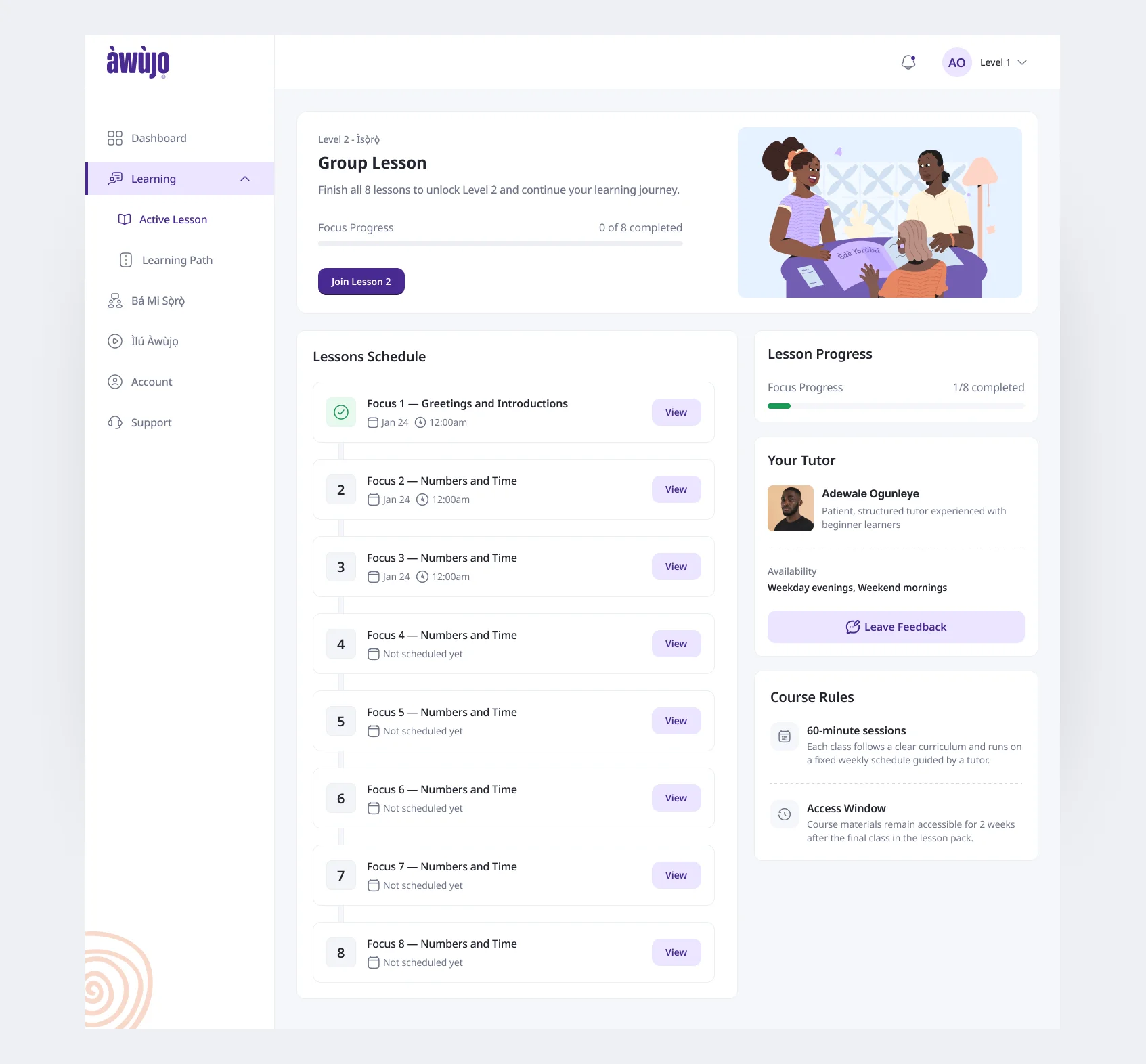
The student portal was the hardest part of the project because Àwùjọ had several concepts describing progress at the same time. A learner has:
- Level – where they are across the overall five-level curriculum.
- Focus – what they are currently learning within that level. Each level contains eight focuses.
- Lesson – the session within their current purchased learning experience.
Those concepts can overlap, but they aren’t interchangeable. A learner can buy a new One-on-One pack and return to Lesson 1 while their curriculum progress continues from wherever they previously stopped. Reschedules, cancellations or missed sessions can also mean Lesson and Focus no longer move forward at exactly the same pace.
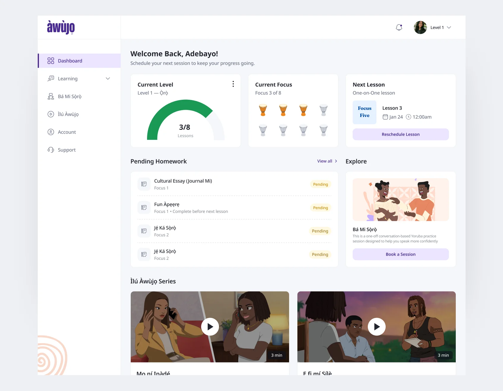
I designed the student experience around the questions that information needed to answer rather than exposing the mechanics underneath it. The underlying system can be complicated. The learner’s answer to “where am I and what’s next?” shouldn’t be.
At a glance, a learner should be able to understand:
Where am I overall? What am I learning right now? What happens next?
Designing For A Misfit
Placement can recommend a level. A profile can help you choose a tutor. Neither can guarantee fit.
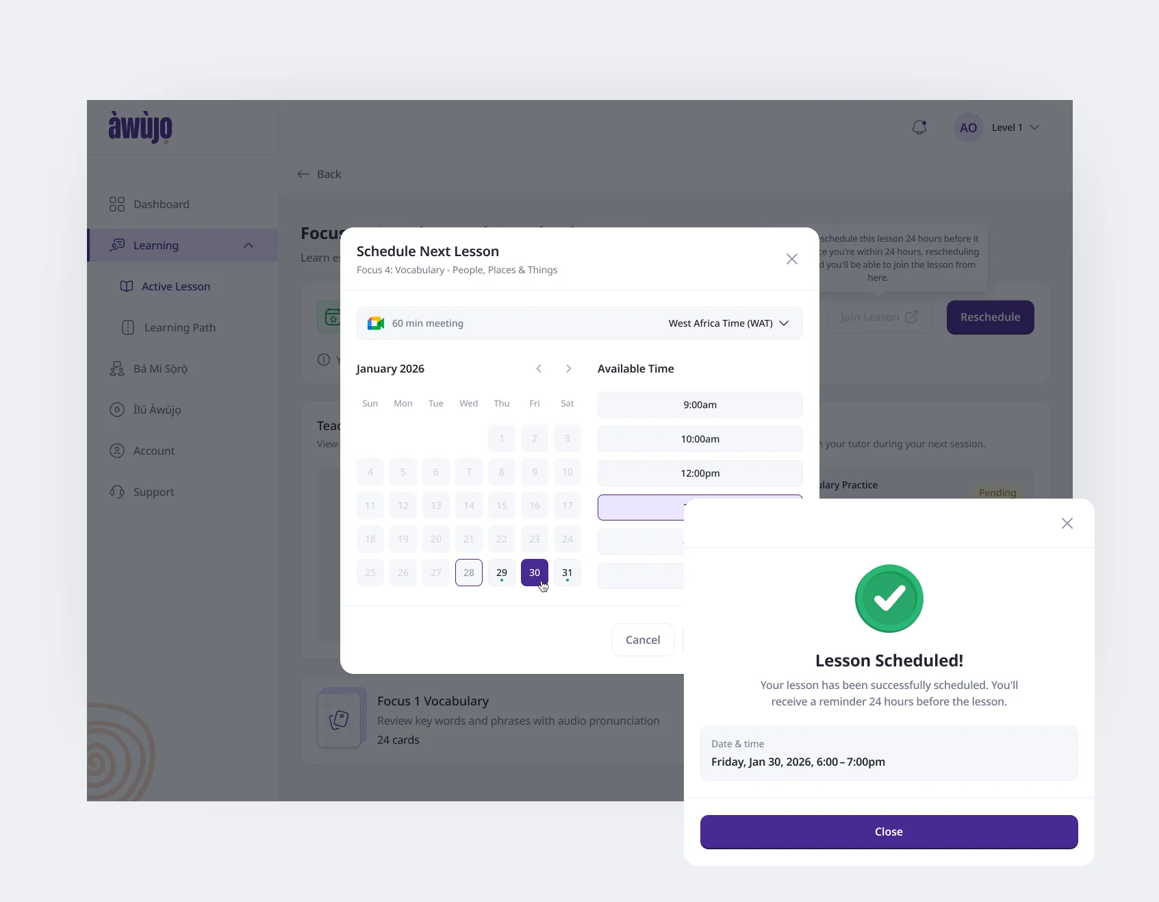
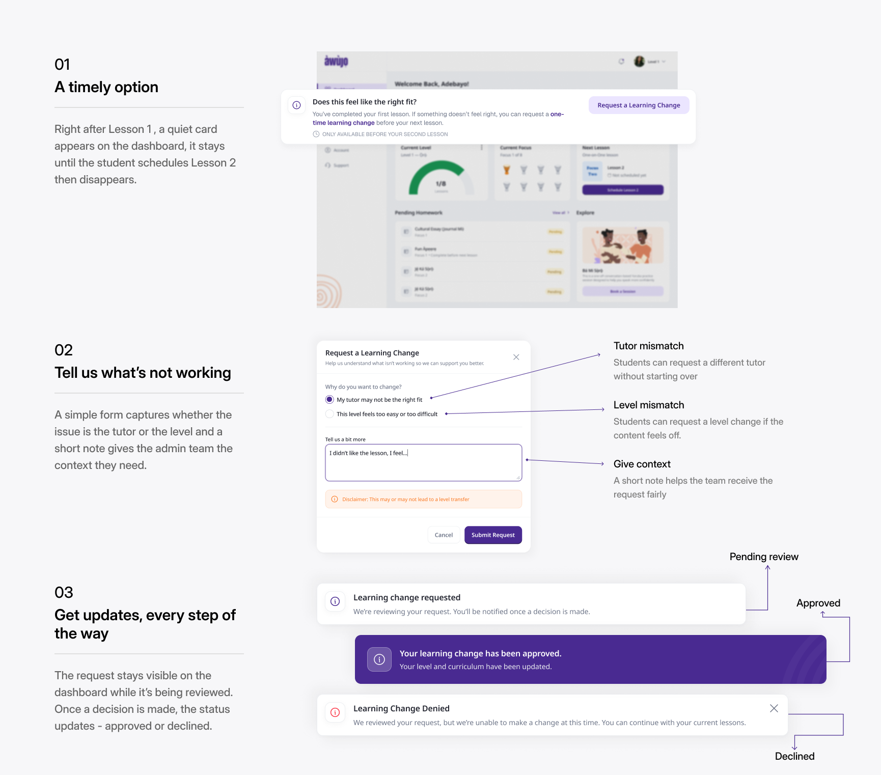
The first actual lesson is the first time a learner can really tell whether those choices work for them. So after Lesson 1, I introduced a quiet check-in on the dashboard: Does this feel like the right fit?
If the level feels too easy or difficult, or the tutor simply isn’t a good fit, the learner can request a one-time learning change before moving on to Lesson 2. The request captures what isn’t working and goes to the admin team for review. Instead of disappearing into a support inbox, its status remains visible to the learner while a decision is being made. If they continue and schedule Lesson 2 without requesting a change, the option disappears.
Practice & Homework
Not everything a learner practises needs to become an assignment.
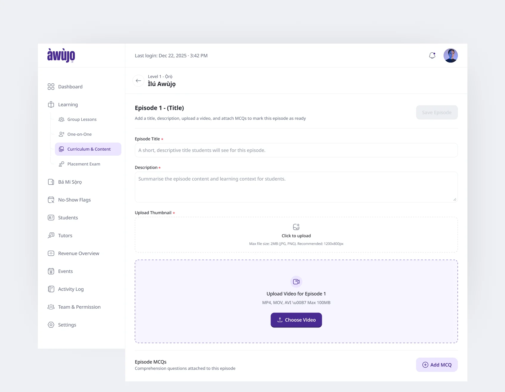
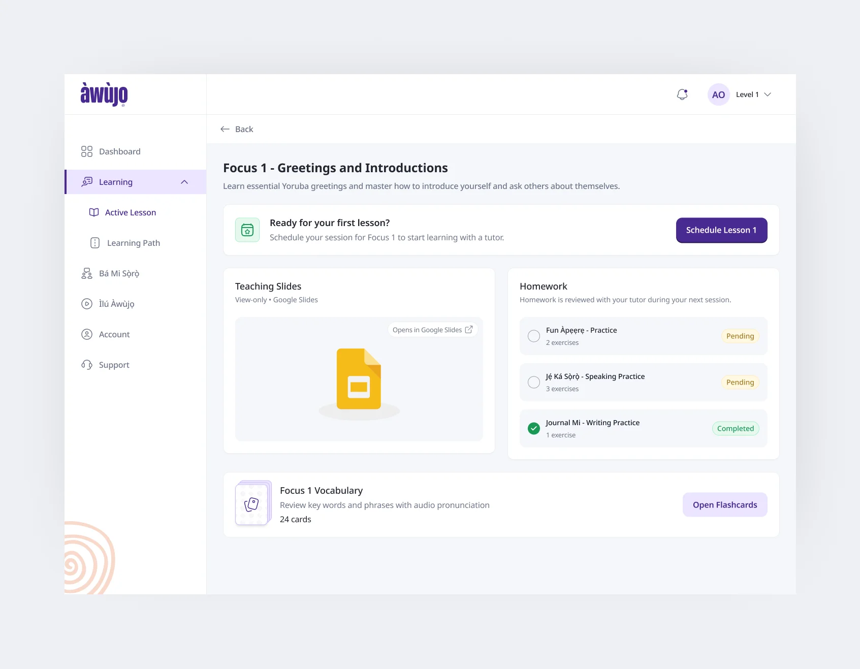
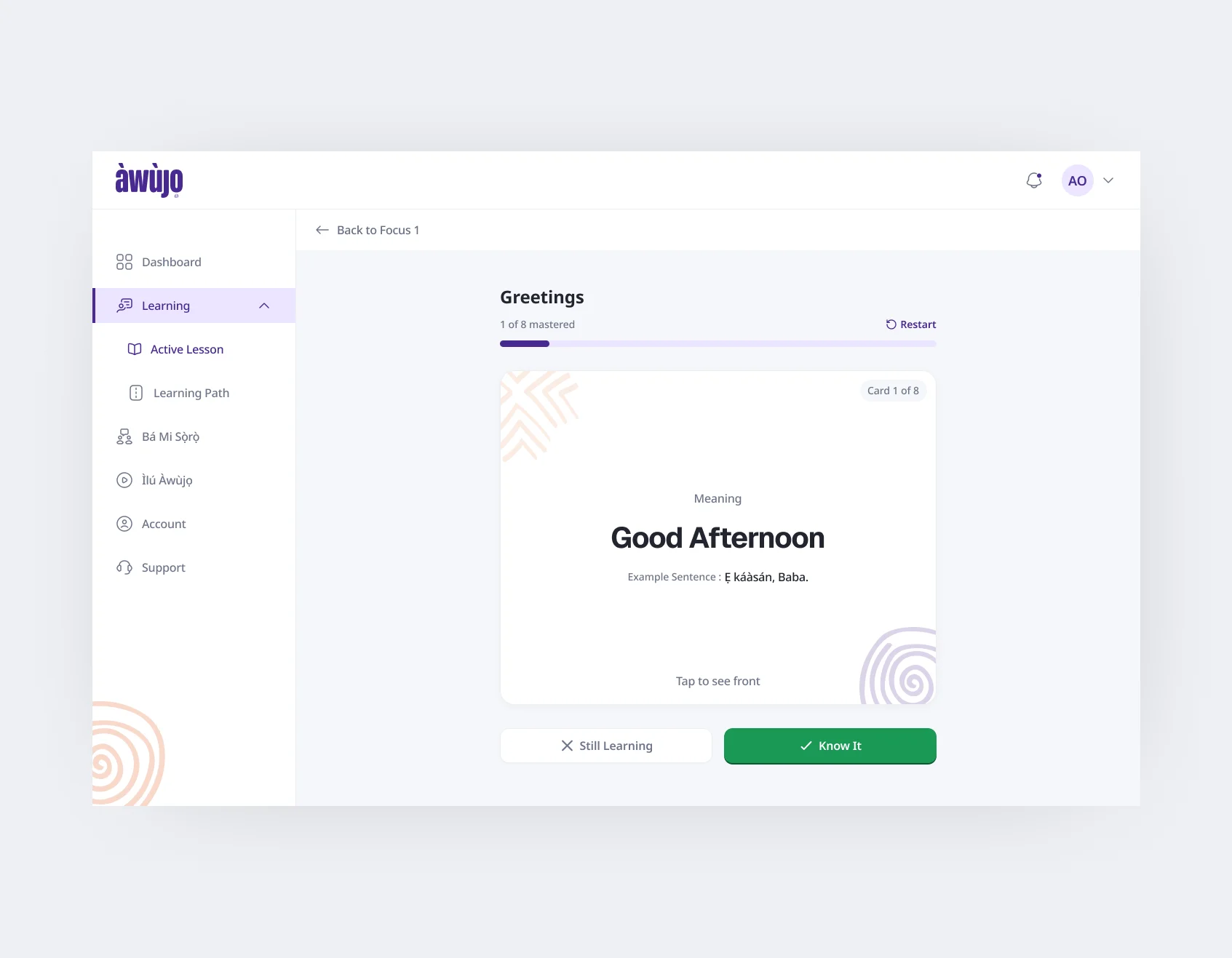
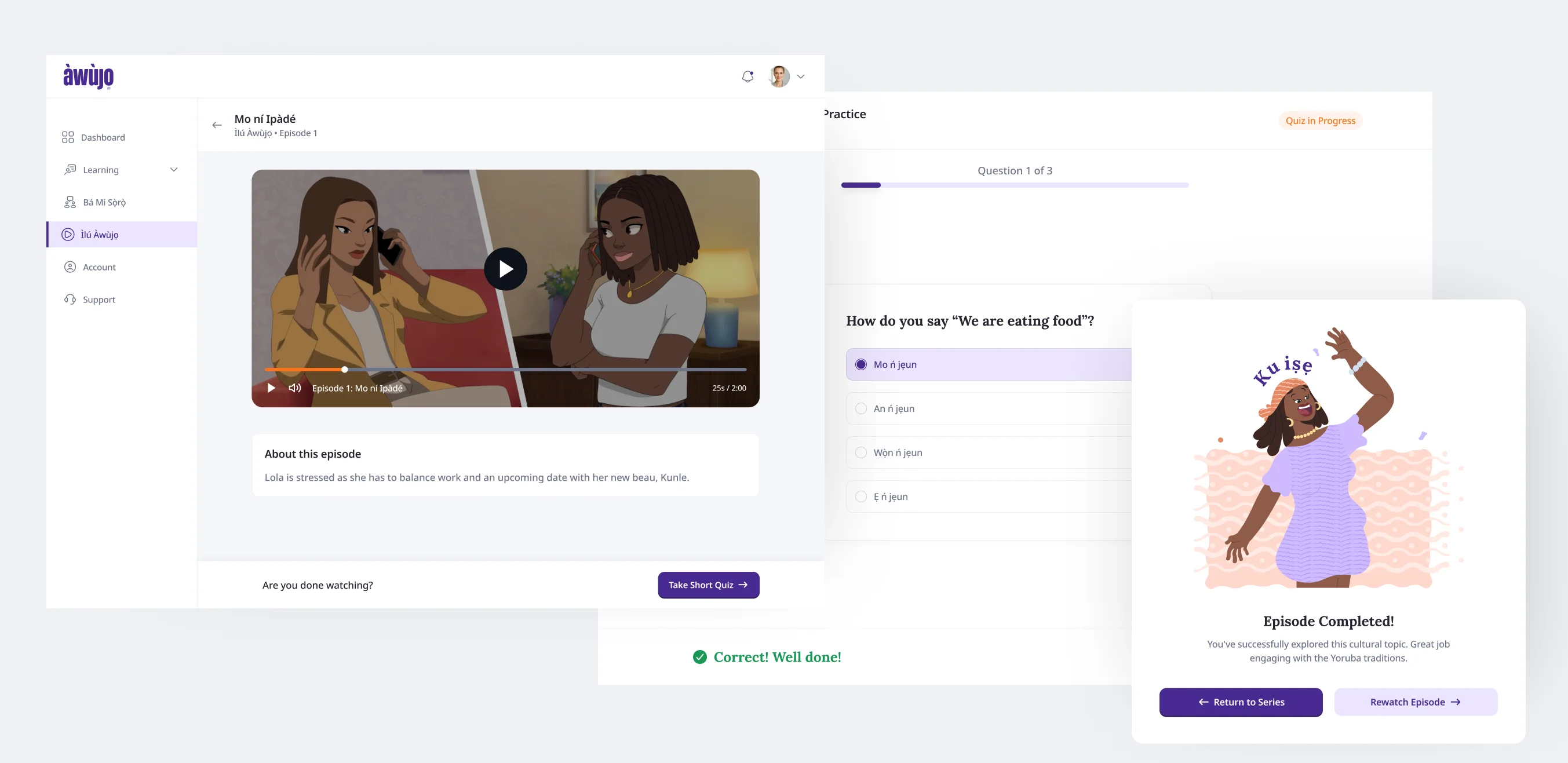
A live class is only one part of learning Yorùbá, so the student portal gives learners several ways to reinforce the current Focus between sessions. Two experiences sit alongside homework: Àwọn Ọ̀rọ̀ – vocabulary flashcards with audio pronunciation and recall practice. Flashcards use pronunciation audio and Know It / Still Learning sorting, with words learners haven’t mastered cycling back into practice until they become more familiar. Ìlú Àwùjọ – short animated stories tied to the learner’s level, followed by comprehension checks.
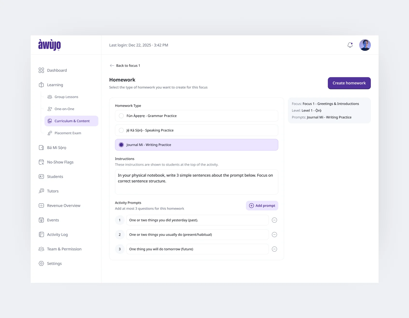
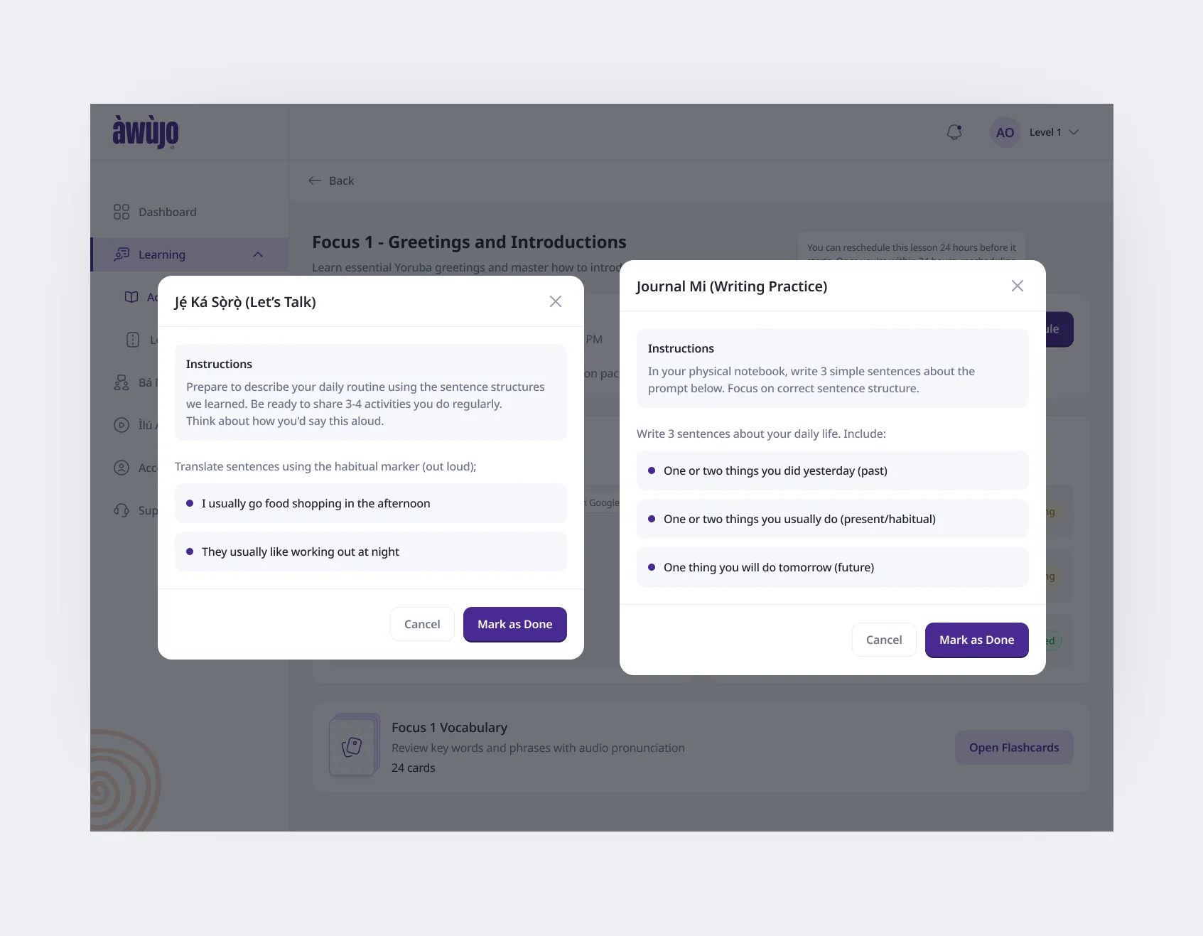
Àwùjọ then has three homework types: Fun àpẹẹrẹ – interactive grammar and comprehension questions. Jẹ́ Ká Sọ̀rọ̀ – speaking prompts learners practise aloud. Journal Mi – guided writing completed in the learner’s own notebook. The distinction was intentional. Not every learning activity needed a score, upload or submission state. Some exercises provide immediate feedback, while speaking and writing deliberately remain open practice that can feed into the next live session.
Outcome
2 ways to learn. 1 way to practise conversation. 5 levels. 40 focuses. One connected journey.
Àwùjọ launched in May 2026. The final product connects discovery, placement, enrolment, tutor selection, scheduling, curriculum progress and between-class practice across the marketing site and student portal.
One-on-One and Group Lessons share the same structured five-level curriculum, while Bá Mi Sọ̀rọ̀ gives learners a lower-commitment way to practise conversation whenever they want more speaking time.
The redesign also gave very different parts of the experience, purchasing a lesson, taking a placement assessment, joining a live class, practising vocabulary and understanding curriculum progress, one consistent system instead of treating them as disconnected tools.
Public learner feedback since launch continues to centre on confidence, cultural connection and structured progression: learners talk about speaking more Yorùbá with family, understanding language they previously missed in music and conversation, and appreciating lessons that feel structured without becoming lectures.
Reflection
I would challenge the information architecture earlier.
I initially spent too long trying to improve the existing direction before questioning whether the structure underneath it was the real problem.
Once I challenged the level-led journey and rebuilt the experience around decisions learners could actually make, the rest of the product became much clearer.
The biggest lesson from Àwùjọ wasn’t how to simplify a complicated interface. It was recognising when the interface isn’t the thing that needs simplifying, the model underneath it is.
Overall, it was a challenging, interesting project I really enjoyed.