Mystocks.Africa: A pan-African investment platform across three markets.
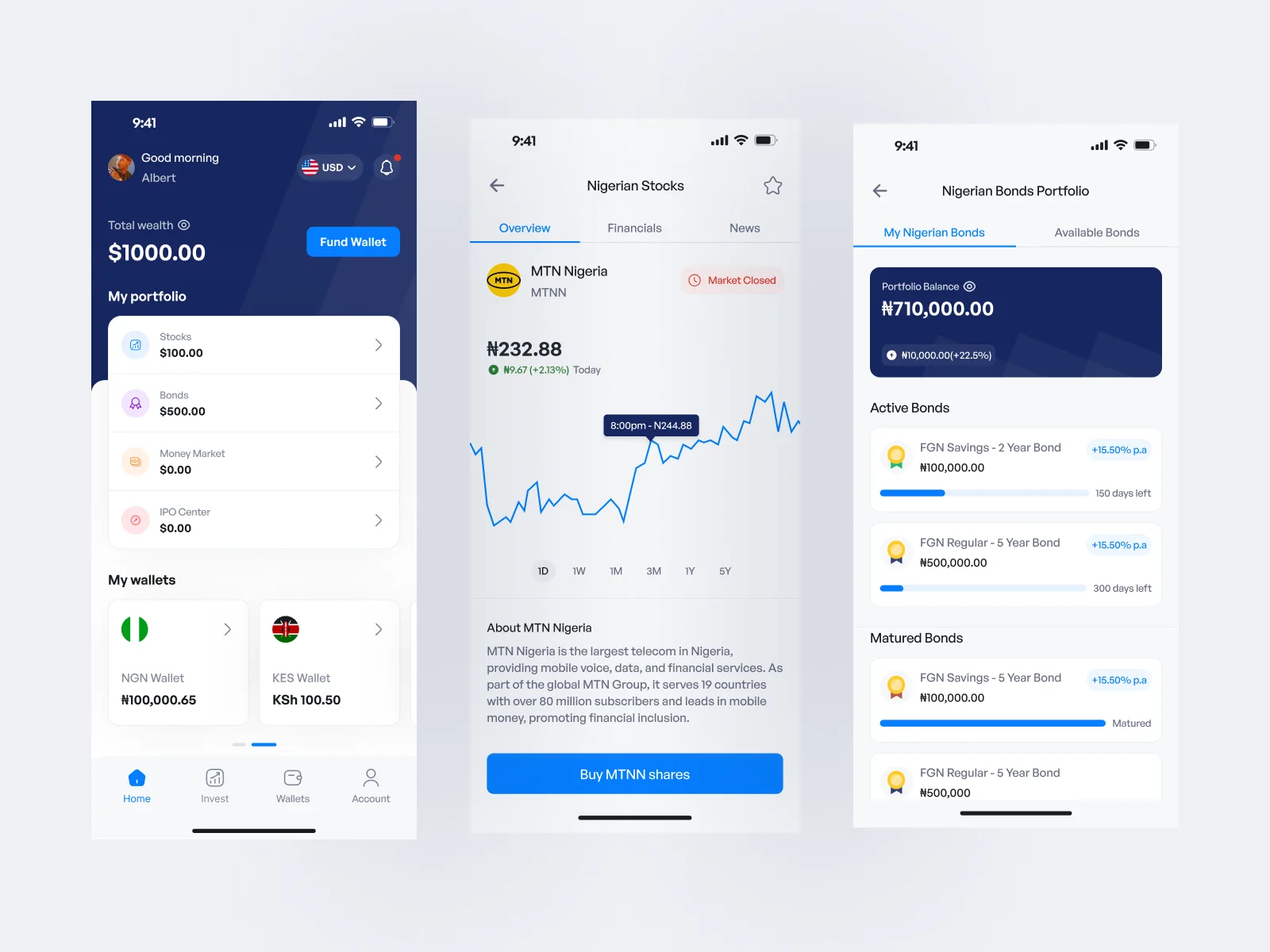
Mystocks.Africa is an investment platform designed to give people access to stocks and bonds across Nigeria, Kenya and Botswana from one place.
I worked as the sole product designer across the entire product ecosystem: the mobile app, web app, admin dashboard and marketing website.
The project involved much more than designing a trading interface. I had to understand how different African markets worked, how users moved money between currencies, how stocks and bonds needed to behave differently, and how the internal operations team would manage everything happening behind the retail product.
The Problem
Three markets, but it still had to feel like one product
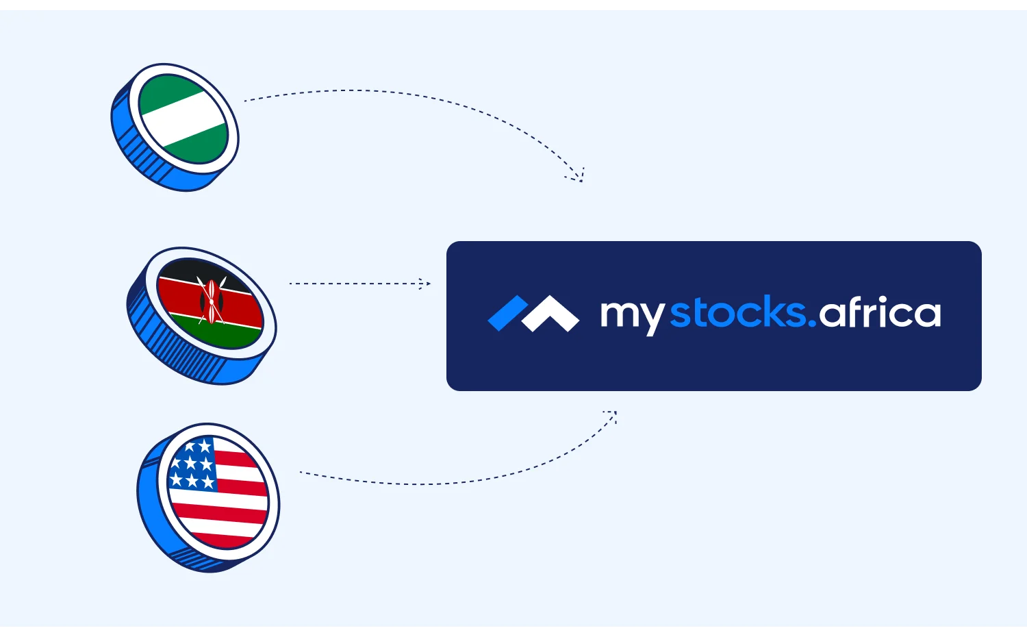
The idea behind Mystocks was straightforward: users should be able to access investments across multiple African markets without needing completely different products for each country.
Designing that experience was more complicated. Nigeria, Kenya and Botswana have different currencies, exchanges, market structures and levels of market data.
A user could potentially own Nigerian stocks, Kenyan investments and assets from Botswana at the same time while managing different currency balances from one account.
So the main question became:
How do we make three different markets feel connected without hiding the differences users actually need to understand?
The goal wasn’t to make every market behave identically. It was to build one product system that could accommodate those differences without making the experience feel fragmented. That question influenced the wallet, portfolio, asset pages, market-data states, order flows and even the admin dashboard.
Research
First, I had to understand what I was designing
When I started working on Mystocks, I knew very little about investing. I understood the general idea of buying shares in a company, but I didn’t have enough practical knowledge of orders, execution, bonds, market prices or what actually happens between tapping Buy and owning an investment. I didn’t want to design the product based on surface-level assumptions.
So I started by learning how investing actually worked. I researched stocks, bonds, order placement and execution, portfolio behaviour, KYC and some of the differences between the markets Mystocks planned to support. The more I understood the mechanics, the easier it became to see where users might become confused and where the interface needed to provide more context.
Using the products myself
I also wanted to understand what investing felt like as a user rather than only looking at competitor screenshots. I registered on Bamboo, Chaka, Trove and M-PESA. Most of my deeper product exploration happened on Bamboo’s mobile experience and Trove’s web experience.
I went through onboarding, explored how investments were presented and started investing myself.
That changed the kinds of questions I was asking while designing Mystocks.
Instead of only asking whether a flow looked simple, I started asking:
- What exactly does a first-time investor need to understand before buying?
- When does money actually leave the wallet?
- What does a pending order mean?
- What information matters before confirmation?
- What happens when an order fails?
- Where does a user go after buying an investment?
- How clearly can they tell what is happening to their money?
Using the products myself helped me understand which patterns actually made investing easier to follow and where I felt uncertain as a user.
By the time I started making the larger product decisions for Mystocks, I had much more context than I had at the beginning.
Product Strategy
One product, different truths
One of the first things that became clear was that a consistent interface didn’t mean every market should appear to behave the same way. For example, the availability and freshness of market information varies.
The Nigerian market could display live pricing, while Botswana used end-of-day pricing. It would have been easy to hide that difference behind the same presentation, but that creates the wrong expectation. Especially in an investment product, users need to know how current the information they’re looking at actually is.
So one of the principles I used was:
Standardise the experience, not the market.
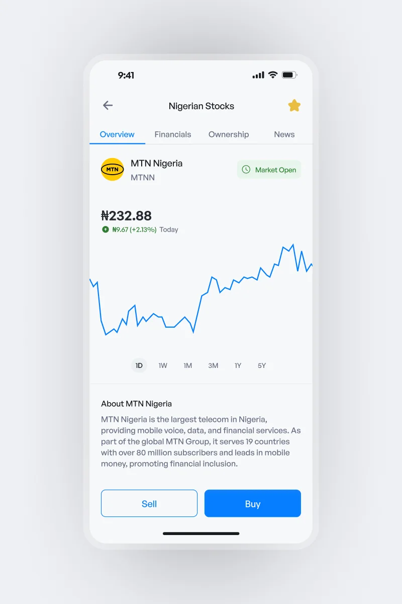
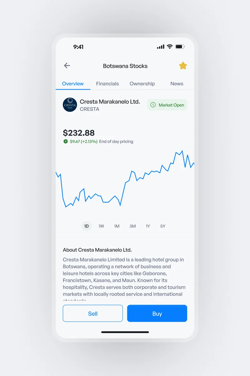
The same product system could be used across countries while still communicating the actual state of the information being shown.
That meant market-specific differences could remain visible without forcing users to learn an entirely different interface every time they switched markets.
Two assets, two different questions
Stocks and bonds also couldn’t be treated as the same product with different labels.
Someone considering a stock is usually trying to understand things like:
- What is the current price?
- Has the price gone up or down?
- How many shares am I buying?
Someone considering a bond needs a different set of information:
- How long is the investment?
- What return does it offer?
- Who issued it?
- How frequently does it pay out?
- When does it mature?
Trying to force both assets into exactly the same information structure would make one or both harder to understand.
Two assets, two flows
I kept the overall Mystocks interaction language familiar while changing the hierarchy based on what the user was buying.
For stocks, the experience prioritises information such as price, price movement, share quantity and market activity.
For bonds, the experience gives more weight to duration, issuer, return, payout structure and maturity.
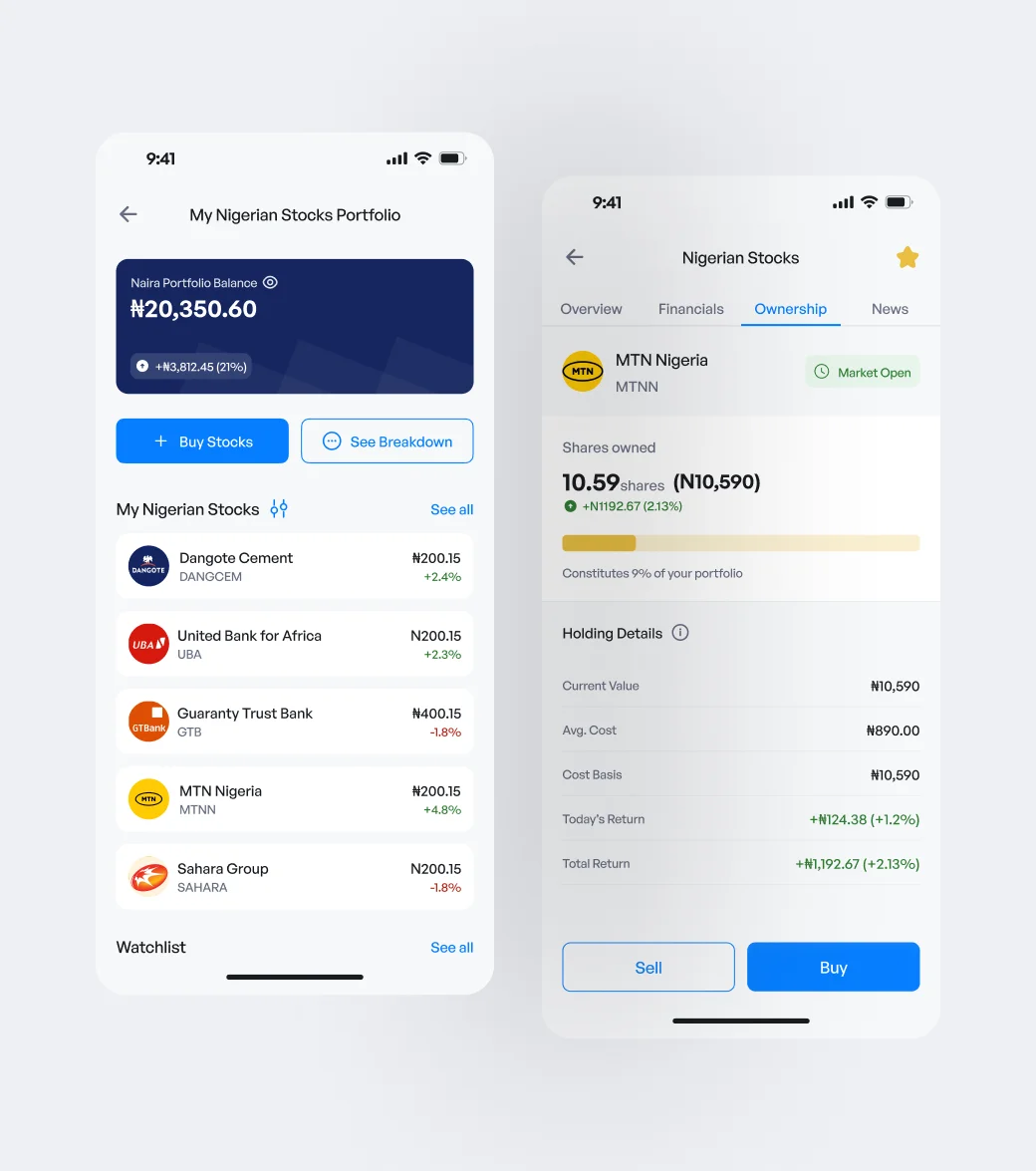
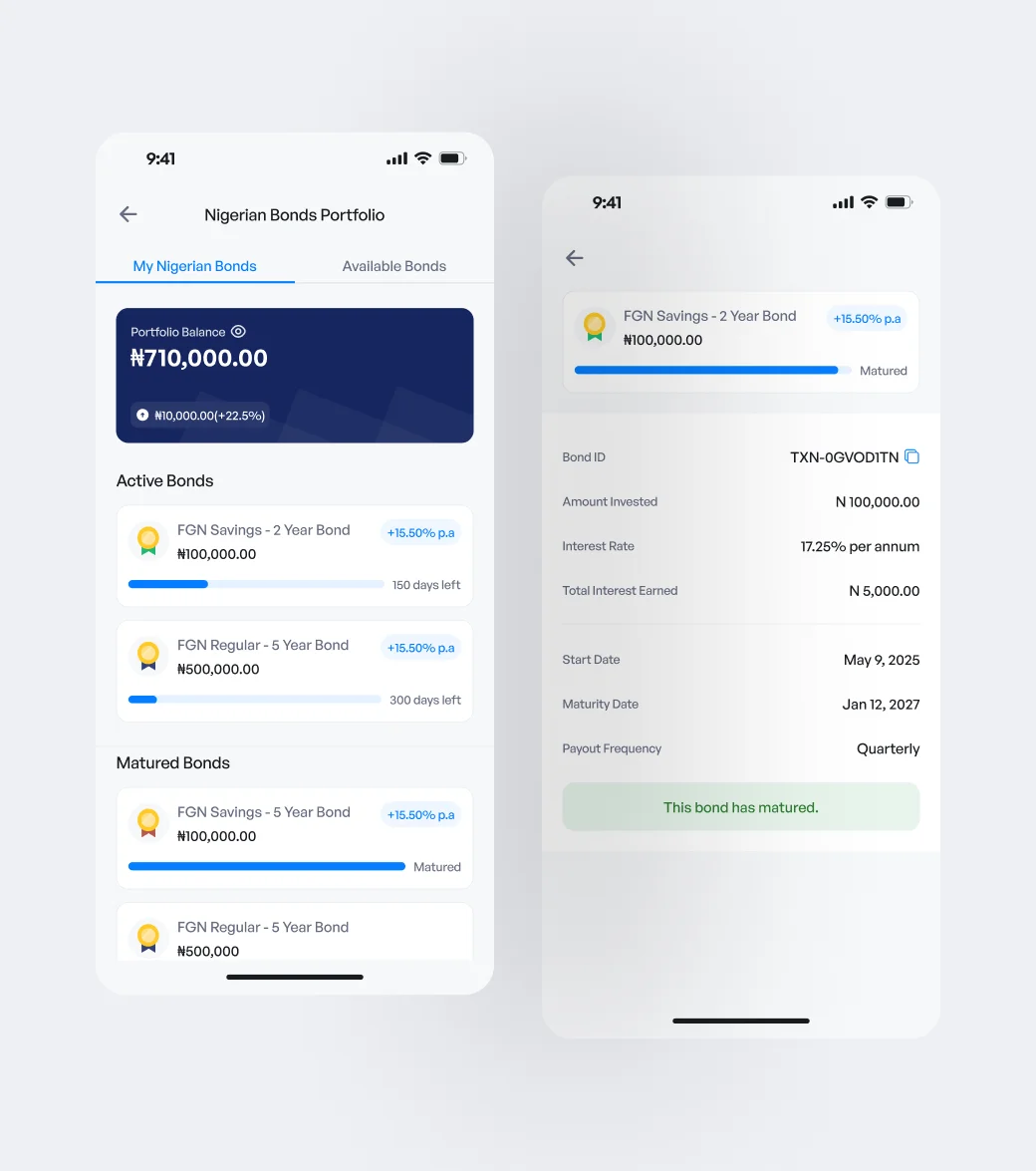
A user can move between both products without feeling like they’ve entered a completely different platform, but the interface still respects the fact that they’re making different kinds of investment decisions.
Core Experience
aMaking investing understandable for someone like me
One thing I noticed while learning how to invest was just how much language I didn’t understand.
Market close. Open price. Volume. Average volume. Market cap. Top movers. Watchlists.
These terms appeared everywhere, and a lot of investment products seemed to assume I already knew what they meant. Sometimes I could figure things out from context. Other times I had to leave the product and look them up myself. That experience stayed with me while I was designing Mystocks. If the product was going to work for people investing for the first time, I didn’t want understanding the interface to depend on already knowing the language of investing.
So I added explanations throughout the product, close to the places where users actually encounter unfamiliar information. Terms such as market close, open price, high, low, volume, average volume and market cap have contextual explanations users can access when they need them. The same thinking applies to features such as Watchlist and Top Movers, so users aren’t left to guess what a section does simply because the terminology is common to experienced investors.
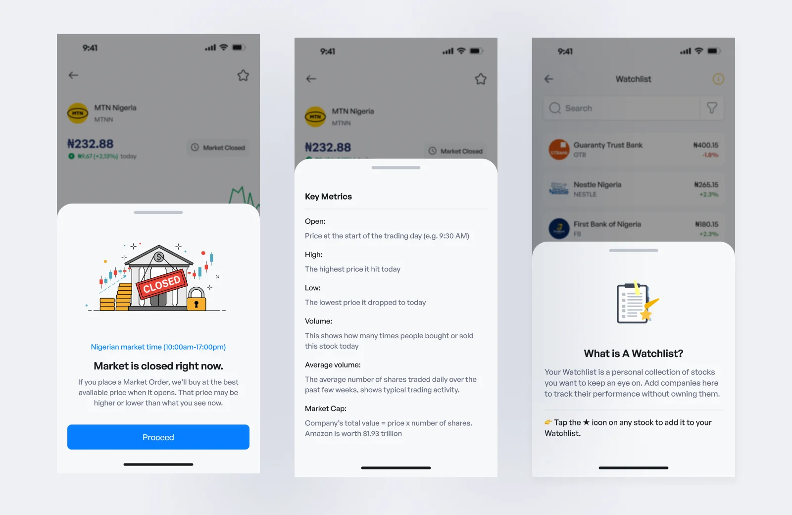
I also used more instructional moments where a definition alone wasn’t enough. For example, when someone explores stocks for the first time, the product doesn’t immediately assume they know how to choose one. It introduces investing through something more familiar: starting with companies they already know and asking simple questions such as whether they understand what the company does and how it makes money.
The goal wasn’t to turn Mystocks into an investing course. It was to make sure a first-time investor could move through the product without constantly feeling like it was designed for someone who already knew more than they did.
Explain things where the questions happen.
bDesigning the journey from signup to first investment
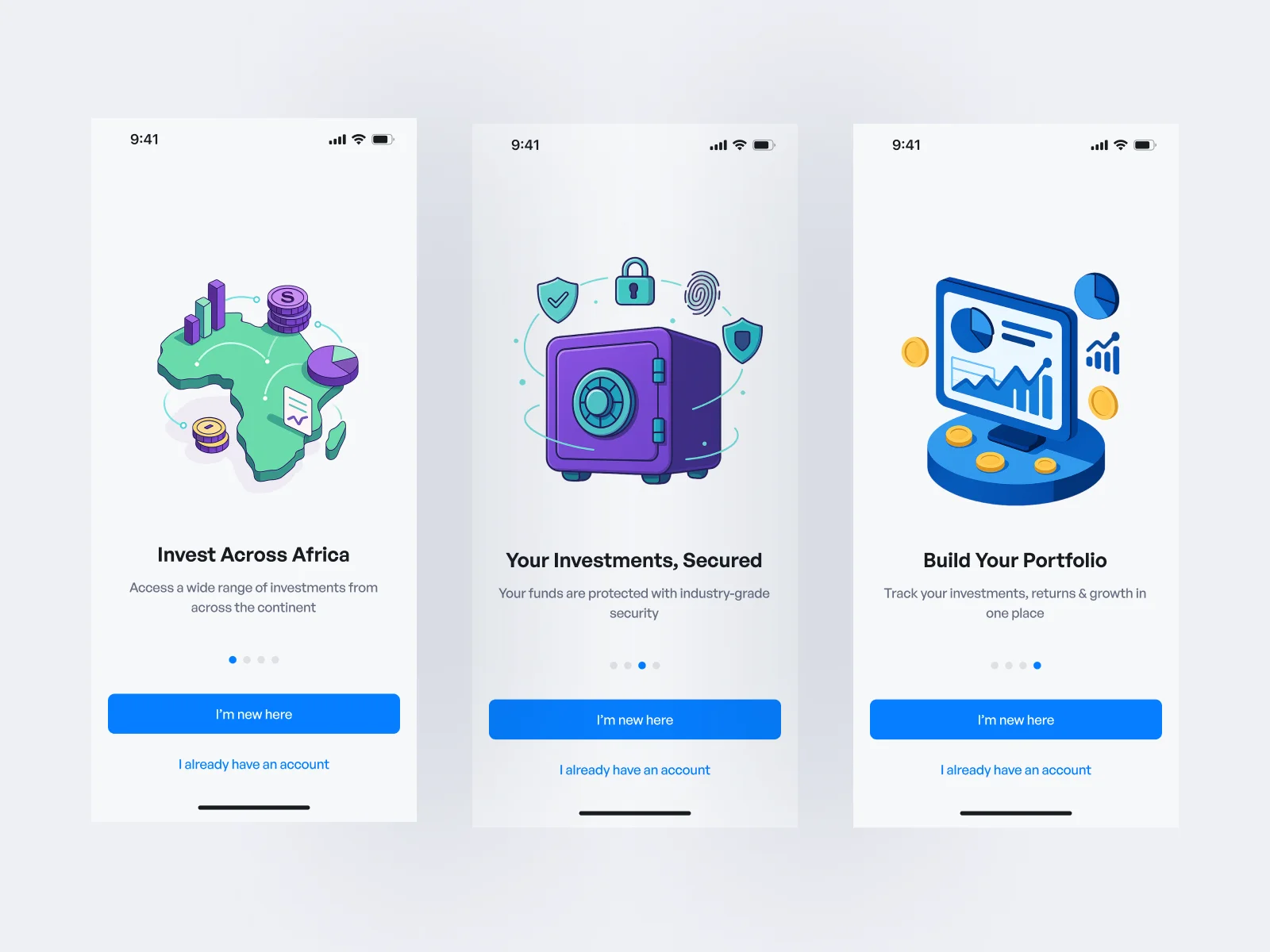
Once the larger product structure was clearer, I moved into the retail investor journey. The core journey needed to take someone from creating an account to being ready to invest without making the beginning of the product unnecessarily heavy.
The overall flow became:
- Create account
- Complete profile
- Complete KYC
- Fund wallet
- Explore investments
- Place order
- Track portfolio
But I didn’t want every piece of account information forced into onboarding.
cOnboarding shouldn’t become a form marathon
Mystocks requires more information from users than a simple consumer app because of account verification and investment requirements. But making users complete every possible profile field before entering the product would turn onboarding into one long form. So I separated getting into the product from completing everything required for the account.
The essential information remains part of onboarding. Profile completion continues afterwards through the profile checklist and account settings. This allows users to enter the product sooner while still making incomplete account requirements visible.
dKnowing where your verification stands
KYC also needed clear status communication. On the retail side, users can see whether their verification is:
- Pending
- Verified
- Rejected
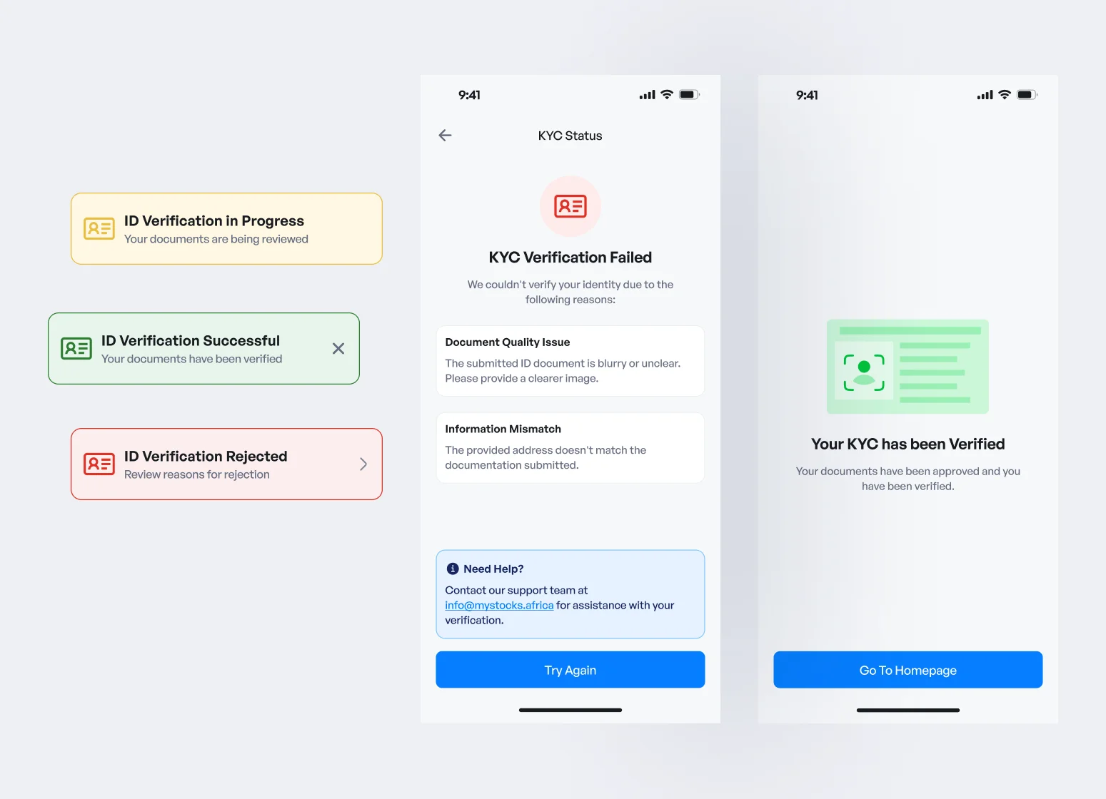
The admin side contains more detailed operational states so the internal team can understand where a submission is in the review process, including states such as submitted, under review and needs attention.
The two experiences don’t need to expose the same level of operational detail. The user mainly needs to know where they stand and whether they can continue. The admin needs enough detail to decide what happens next.
eSlowing down when an order becomes real
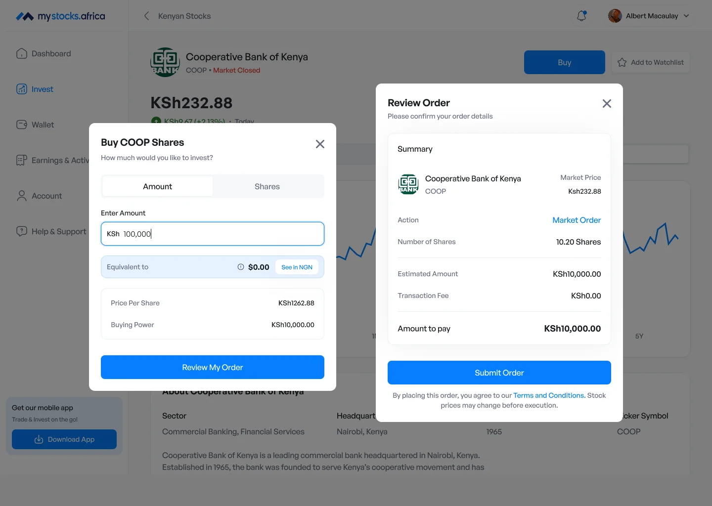
I wanted exploring investments to feel relatively quick. Actually committing money needed more care. Before an order is submitted, users are given a review step where they can see the relevant order information before final confirmation.
That became another principle I used throughout the product:
Move quickly through exploration. Slow down when money moves.
A confirmation step adds another interaction, but in this context the extra moment is useful.
It gives users a final opportunity to understand exactly what they’re about to do.
Wallet & FX
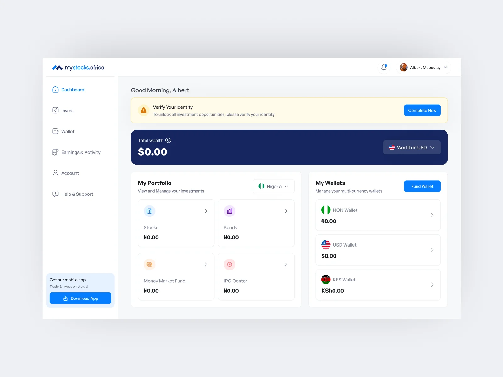
One account meant dealing with multiple currencies
Supporting multiple markets also meant Mystocks couldn’t rely on one simple wallet balance.
The final product uses:
- NGN / ₦ for Nigeria
- KSh for Kenya
- USD / $ for Botswana
Each balance remains visible rather than being hidden inside one automatically converted total.
This means users can understand what money they currently hold and which currency they’re working with before making an investment.
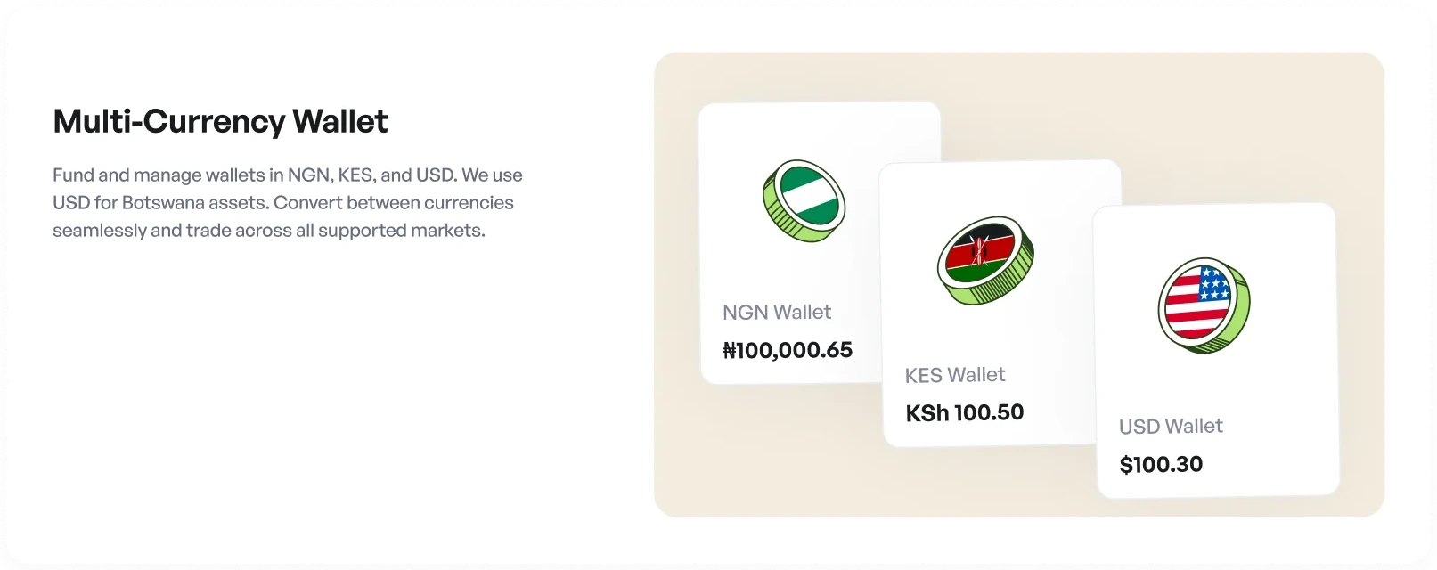
The wallet also gives users a central place to see money moving in and out of their account.
Reviewing a currency conversion
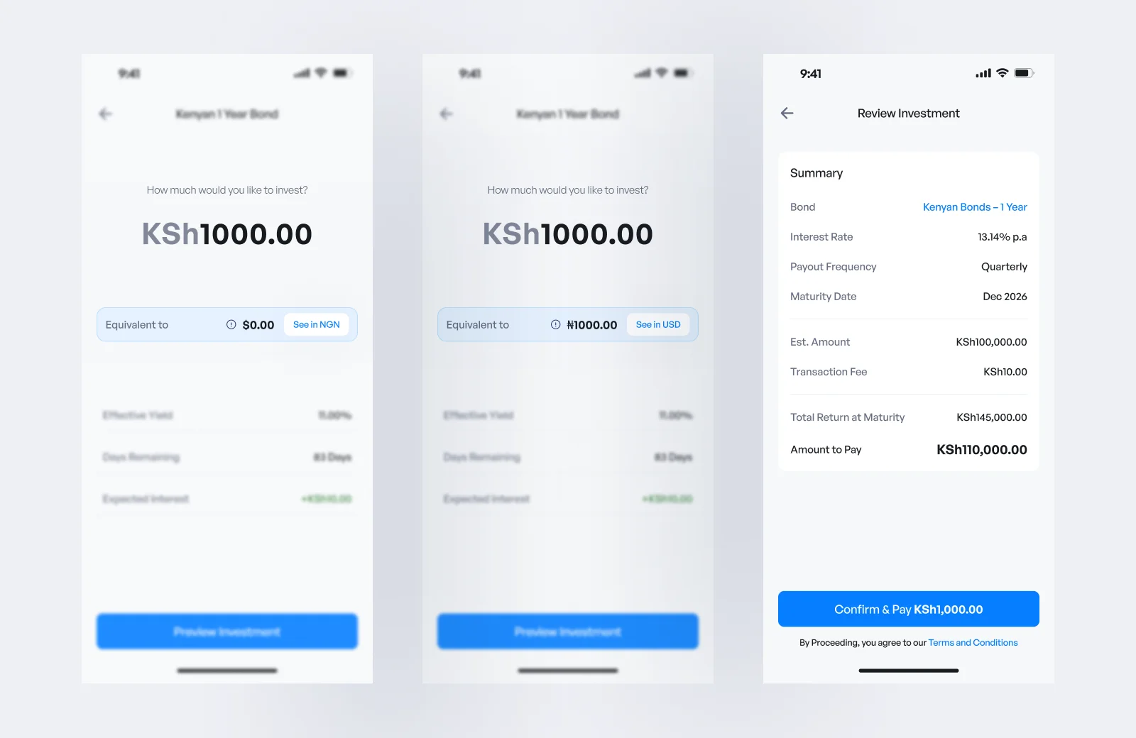
When users move money between currencies, Mystocks gives them a review step before the conversion is completed.
The review shows the amount being converted, the conversion rate, applicable fees and the final amount the user will receive.
This gives users a chance to understand the conversion before confirming it, rather than only seeing the result after their money has moved.
Operations
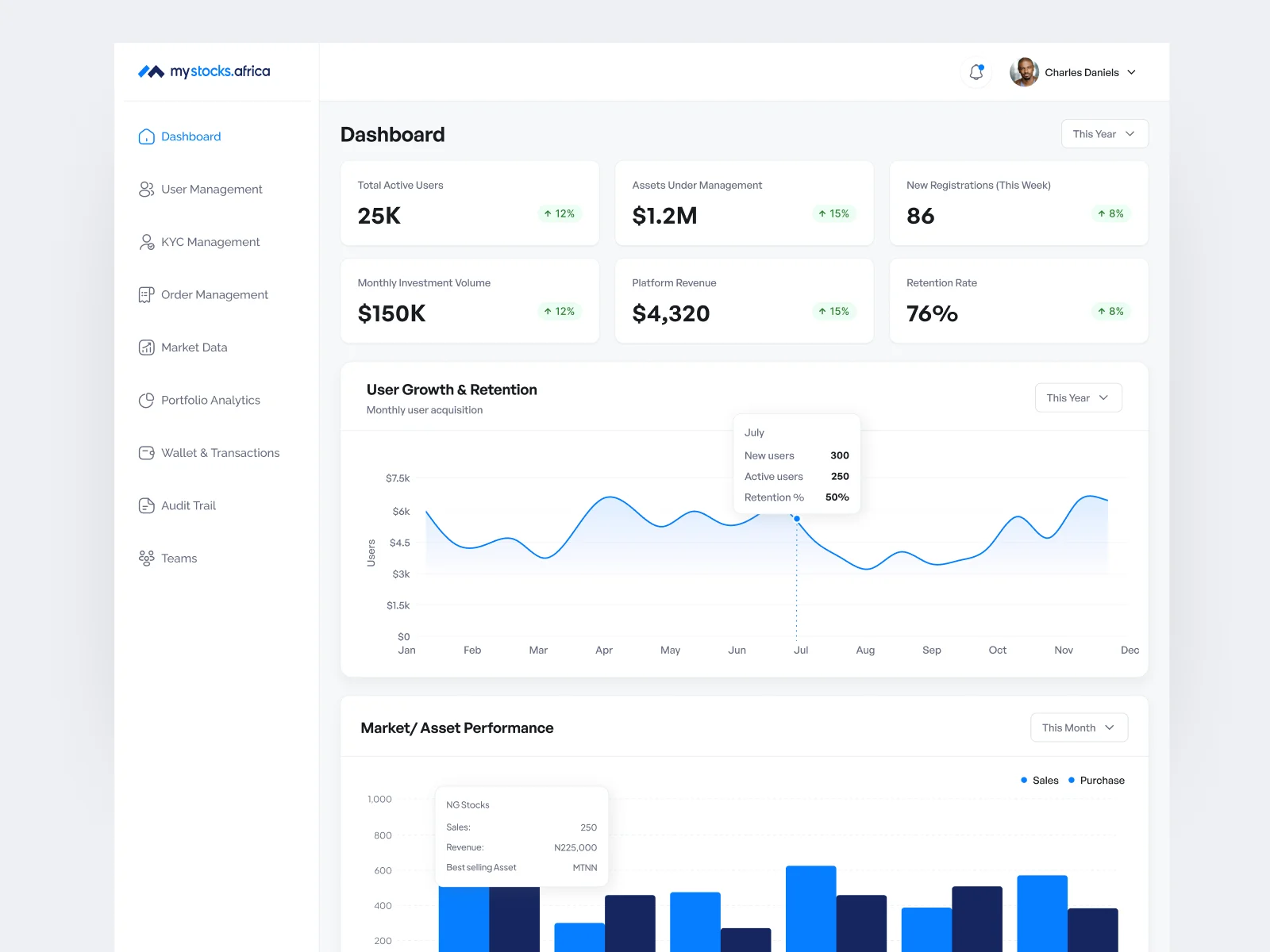
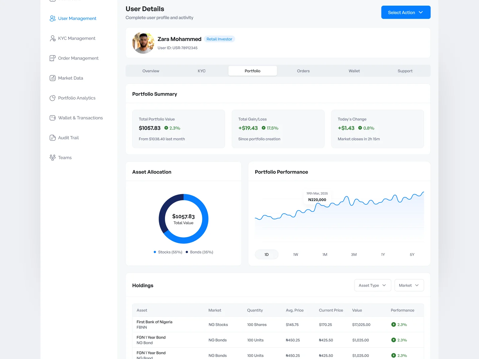
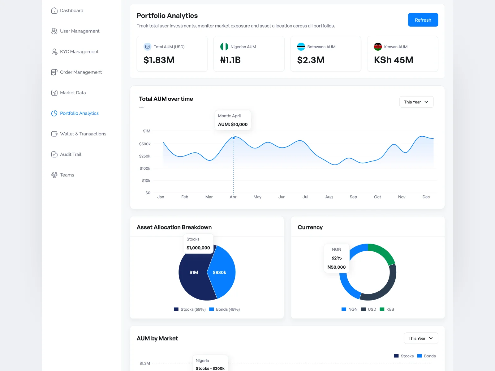
The admin dashboard wasn’t just an internal tool
Mystocks also supports institutional investors, and their experience works differently from retail. Retail users can use the product directly to manage their investments.
Institutional investors can send bulk orders to the operations team by email, after which the internal team manages those orders through the admin dashboard.
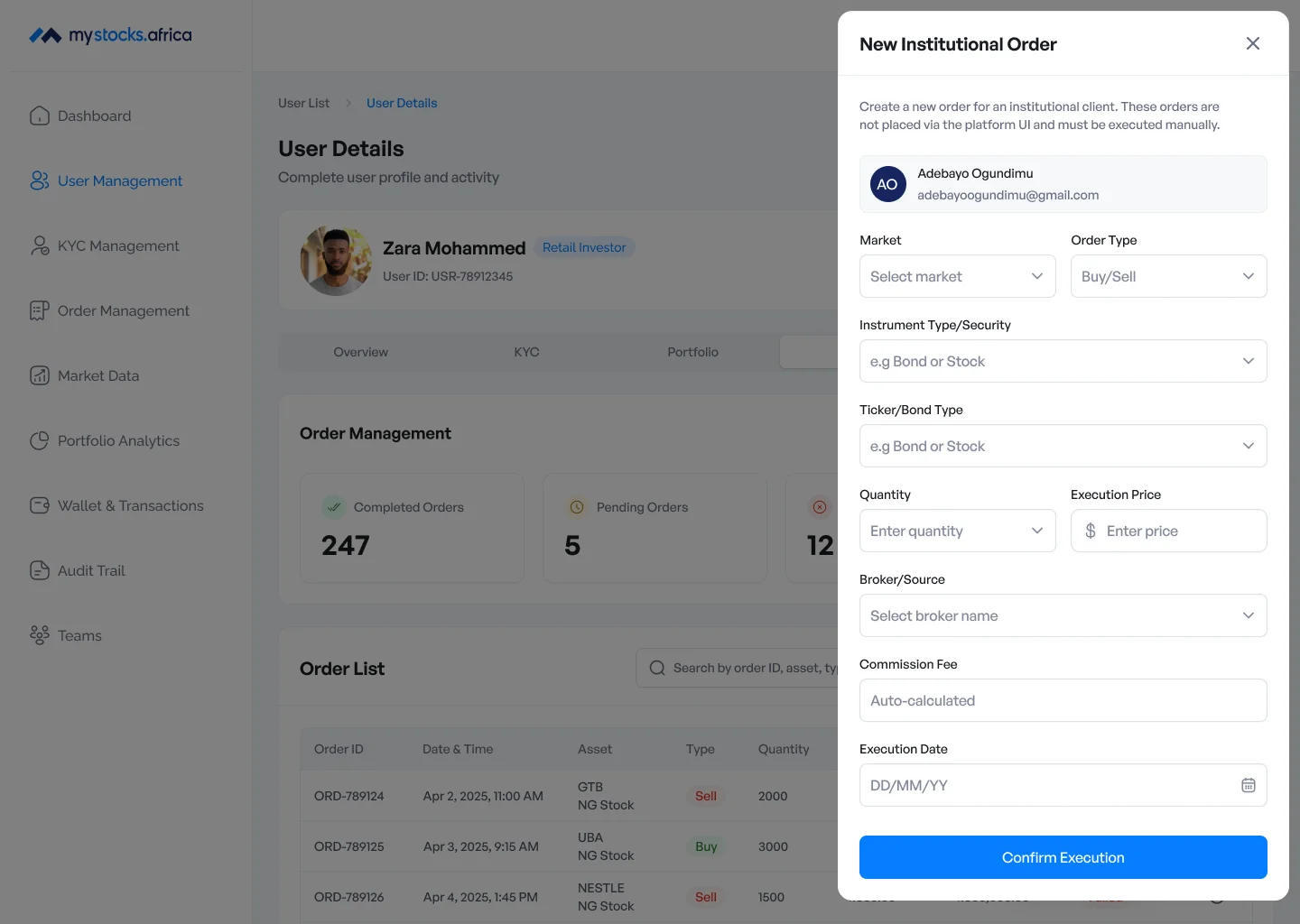
That changed the importance of the admin experience. For institutional investors, the admin dashboard is part of their product experience.
They may never interact with the dashboard themselves, but the ability of the operations team to enter, understand and manage their orders affects the experience they receive from Mystocks.
So I didn’t treat the admin dashboard as something that could be designed after the main product was finished. It was another core part of the system.
Bringing retail and institutional orders together
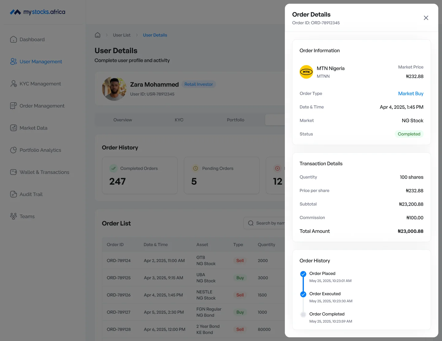
The order-management experience needed to accommodate orders coming through different routes.
Retail and institutional orders could both be managed through the internal product while still retaining the information the operations team needed to understand how an order entered the system and what needed to happen next.
The admin order states include:
- Pending
- Requires Manual Processing
- Completed
- Failed
- Cancelled
The goal was to make operational status easy to scan without forcing the team to open every individual order just to understand what was happening.
For institutional orders, admins can also create and manage the order manually from the dashboard.
Designing actions based on how much attention they need
The dashboard contains different kinds of admin actions. Some require a lot of information. Others are short but have more serious consequences. Using exactly the same interaction pattern for all of them didn’t make sense.
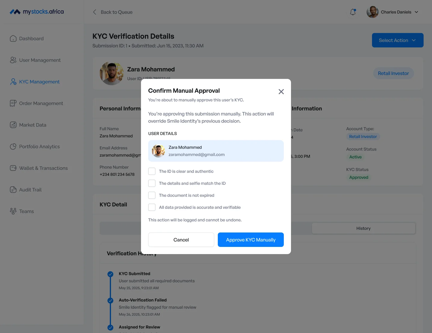
I used side panels for more detailed viewing and longer forms where keeping the underlying dashboard visible helped preserve context. For example, adding or editing a user can contain several fields and benefits from the additional vertical space of a side panel. I used centered confirmation modals for shorter actions that require a more deliberate decision, such as suspending a user.
The distinction became:
- Side panelWork
- ModalDecide
Managing KYC from the admin side
KYC looks much simpler to the user than it does internally.
The admin dashboard needs to give the operations team enough visibility to understand what has been submitted, what is being reviewed and where attention is required. Admins can review verification information, see the current status and take the relevant action where necessary.
This gives the internal team more operational detail without exposing that complexity to the retail user.
Website
Trust starts before someone creates an account
The product itself wasn’t the first Mystocks experience most people would see. The marketing website was.
For an investment platform asking users to eventually put real money into the product, the website needed to do more than look polished. It needed to explain what Mystocks actually offered and give users enough information to decide whether they wanted to continue.
The final marketing site includes:
- Homepage
- Stocks product page
- Bonds product page
- About
- FAQ
- Blog
- Legal pages
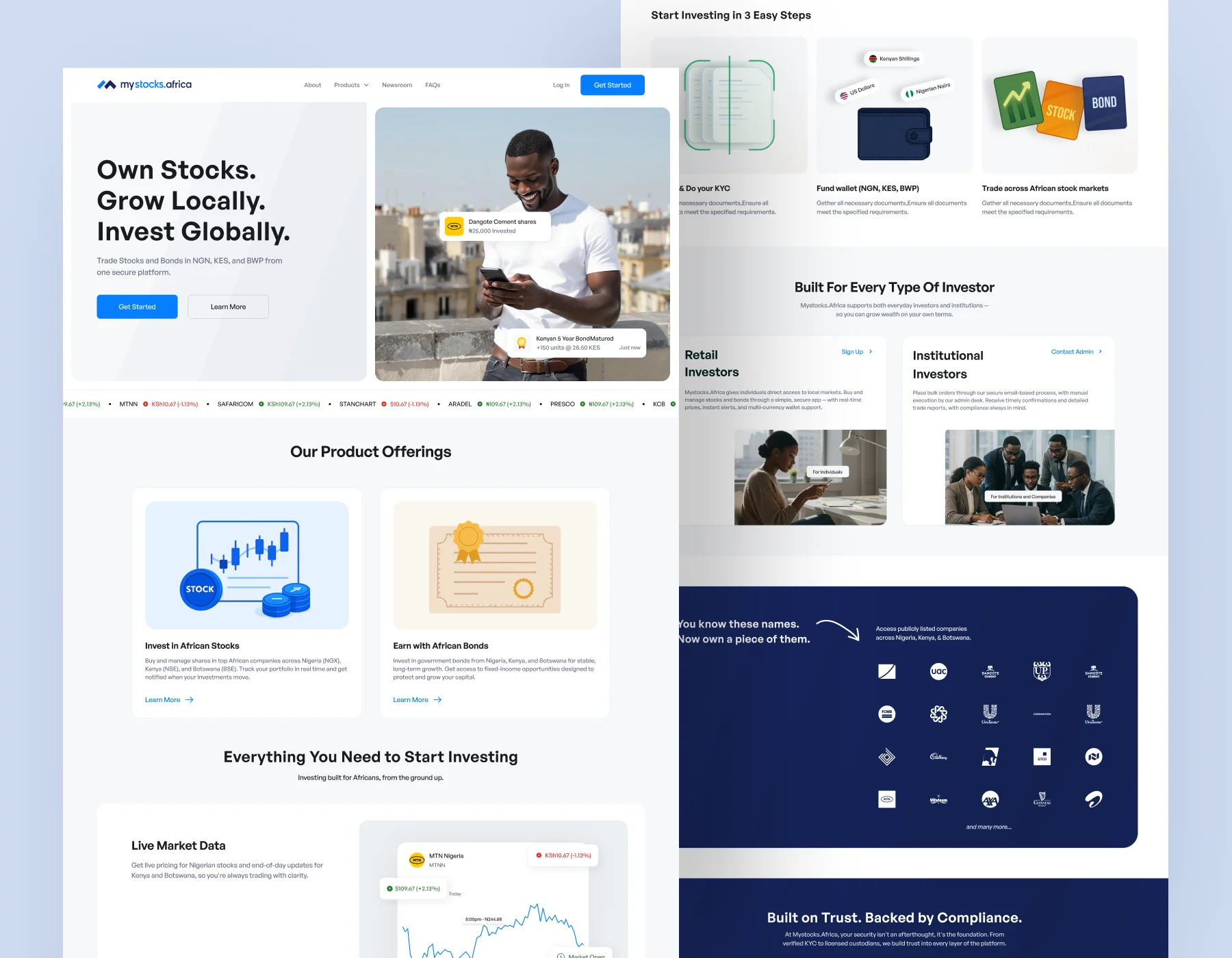
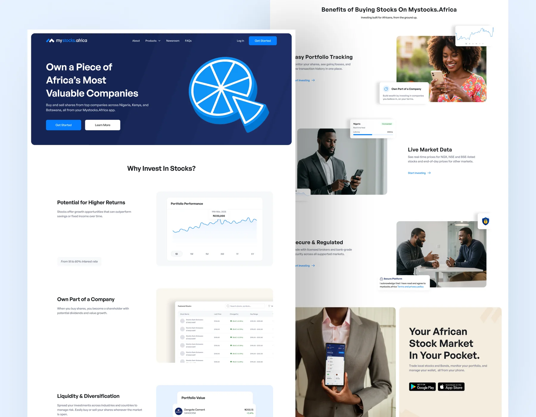
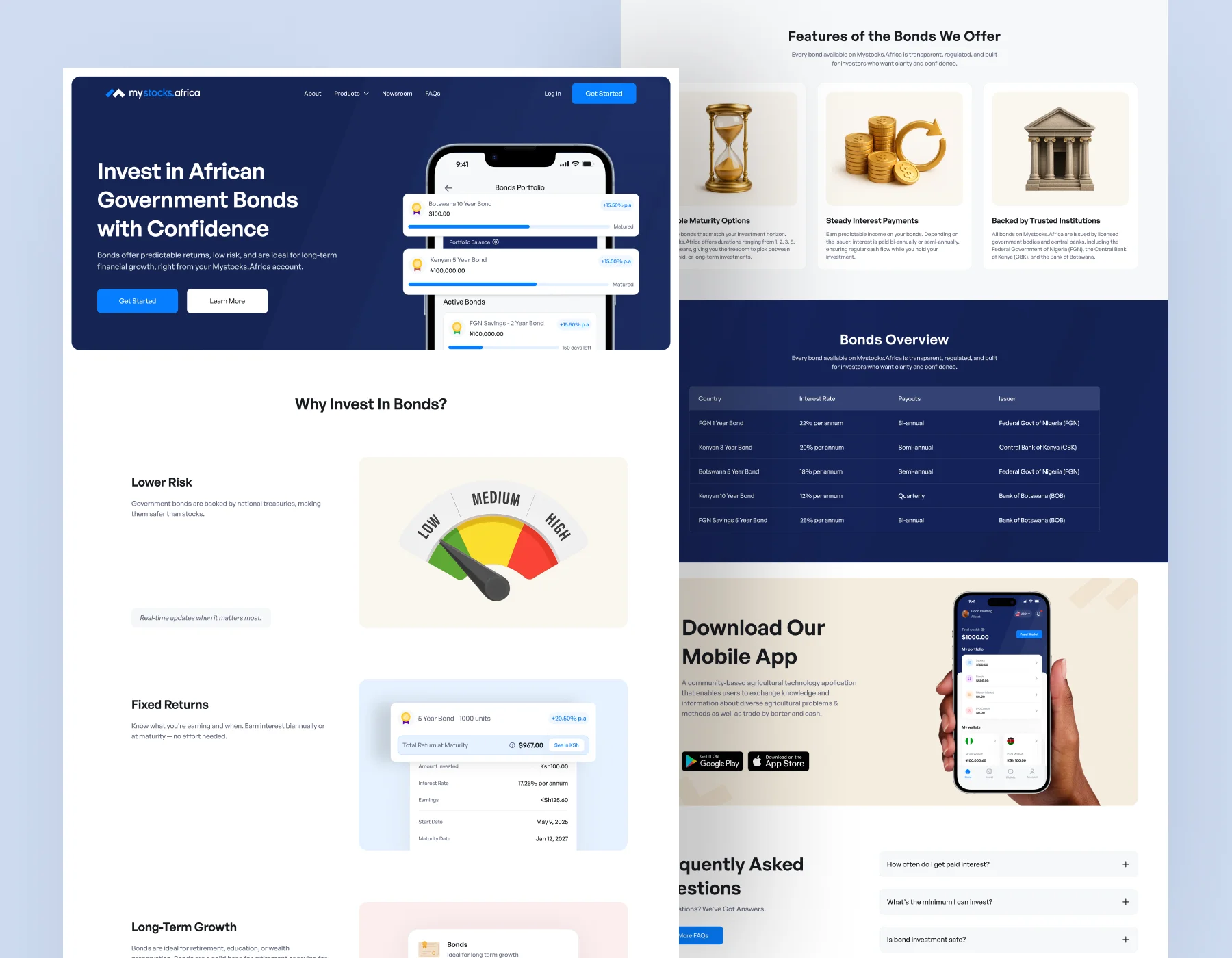
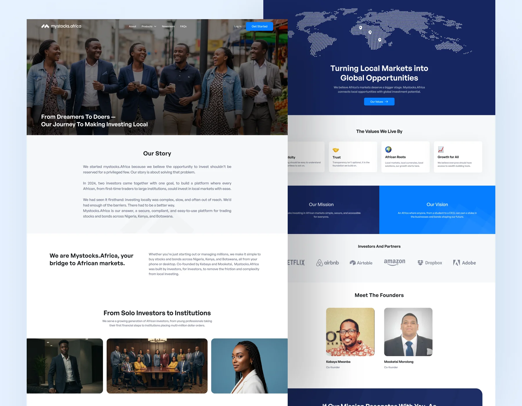
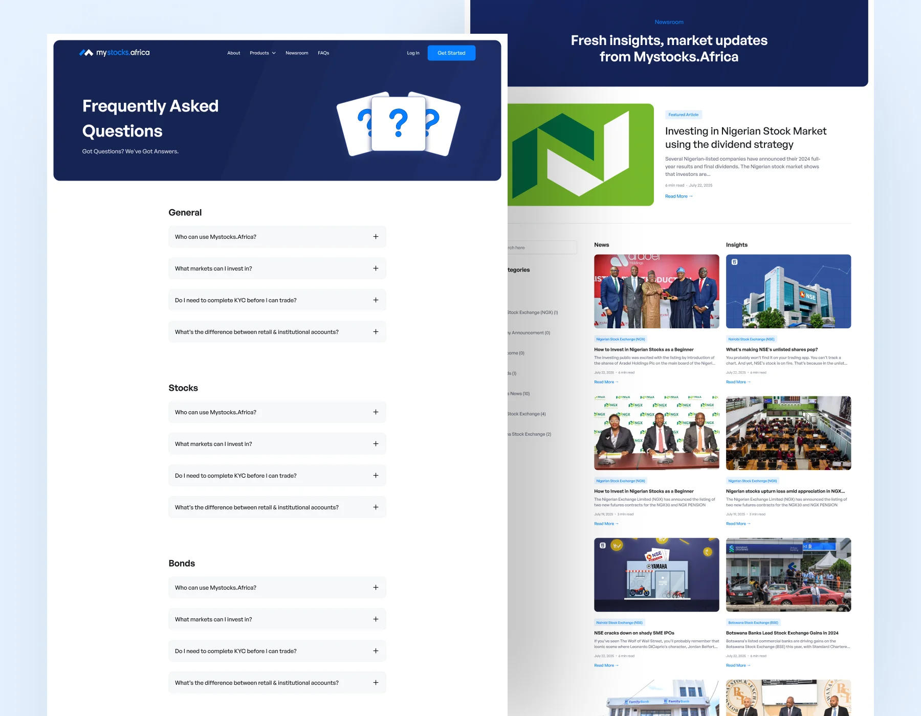
Security and compliance information was also incorporated into the homepage rather than becoming a separate final page.
The stock and bond product pages allow people to understand the two investment types before signing up, while the FAQ, blog and legal pages support the questions users may have before committing to the product.
Reflection
What this project changed for me
Mystocks was one of those projects where I had to learn the domain before I could properly design the product.
I started with very little practical knowledge of investing.
By the time I was deep into the project, I was using investment products myself, understanding the differences between stocks and bonds and asking much better questions about what should happen before and after a financial transaction.
It also made me much more conscious of the difference between consistency and sameness.
- Nigeria, Kenya and Botswana didn’t need identical behaviour.
- Stocks and bonds didn’t need identical pages.
- Retail and institutional investors didn’t need identical journeys.
- And a quicker interaction wasn’t automatically better simply because it removed a step.
A large part of the work became deciding where the experience should stay consistent and where the differences were important enough to remain visible. That thinking shaped the wallet, investment flows, order experience, admin dashboard and the way information was communicated throughout Mystocks.
The final system
By the end of the design phase, Mystocks had become four connected product surfaces.
They serve different purposes, but they are all part of the same product system.